
Web Accessibility for Reading: Digital Readability Guide
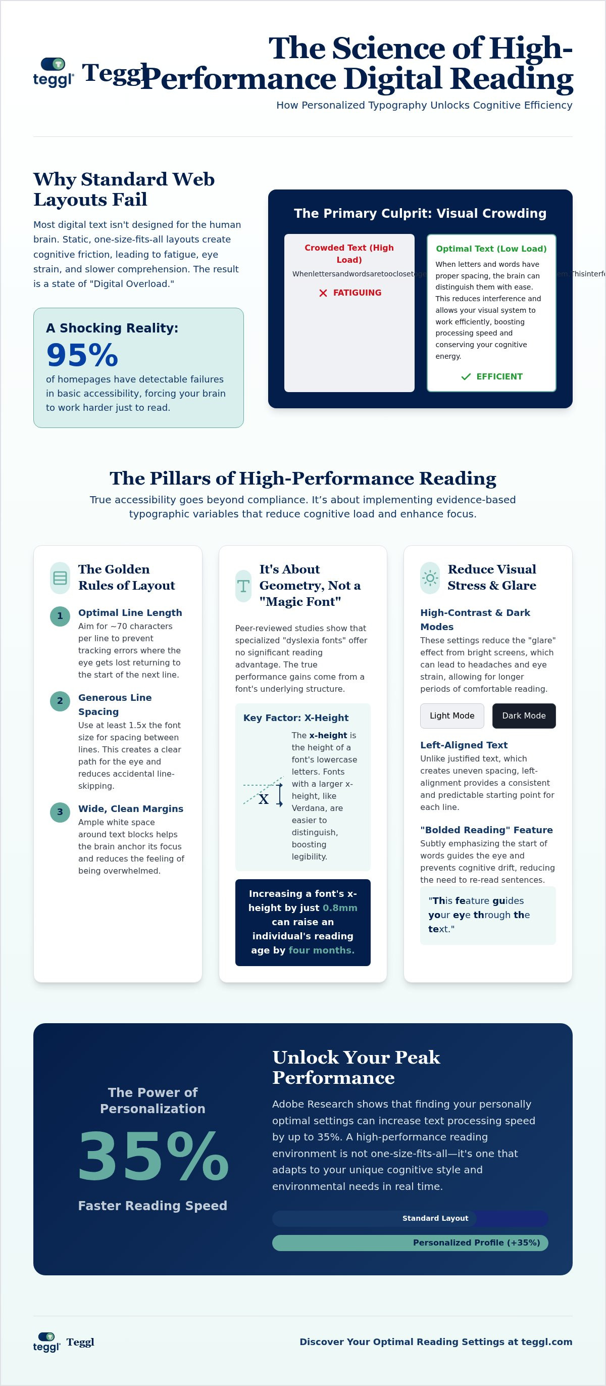
What if the digital layout you're struggling to navigate was never actually designed for your brain? You've likely felt the frustration of skipping lines or the burning eye strain that comes after twenty minutes of deep work. It's easy to blame your own focus, but the reality is that most websites are static and rigid. In fact, 2025 research shows that over 95% of homepages have detectable failures in basic accessibility. When the standard experience is broken, finding the right web accessibility features for reading isn't just a convenience. It's a necessity for reclaiming your cognitive energy and performance.
You deserve a digital environment that adapts to you, not the other way around. This guide explores how scientific typographic adjustments can increase your reading speed by up to 35% while significantly reducing mental fatigue. We'll break down the mechanics of visual crowding, the power of personalized reading profiles, and the evidence-based settings that transform a cluttered screen into a clear, high-performance workspace.
Table of Contents
The Science of Digital Reading Fatigue: Why Standard Web Layouts Fail
Digital reading is fundamentally more taxing than paper. This "Digital Overload" phenomenon occurs because standard layouts force the brain to work harder just to decode symbols. It's vital to look beyond basic compliance. For a broader context, a Web accessibility overview helps explain how general design standards often miss individual needs. Most sites fail because they ignore "Visual Crowding," a state where characters interfere with each other and exhaust your processing power.
There is a stark difference between "Access" and "Performance." Access means you can see the text; performance means you process it efficiently without fatigue. Adobe's research confirms that there is no single "best" font for everyone. Instead, reading speed depends on how a layout matches your specific cognitive style. Without the right web accessibility features for reading, your brain wastes energy just trying to stay on the correct line.
Visual Ergonomics: The Hidden Barriers in Modern Web Design
Character width, weight, and spacing dictate how your eyes move during the perceptual stages of reading. When these variables are static, readers often experience line-skipping. Tools that create a "Reading Ruler" effect can mitigate this by providing a visual anchor. Research from the University of Leeds shows that highly legible layouts increase efficiency even when there is no time pressure. This proves that optimizing web accessibility features for reading isn't just a luxury. It's a fundamental shift that allows for faster comprehension and sustained focus throughout the day.
Essential Web Accessibility Features for Enhanced Reading Performance
Many platforms promote specialized "dyslexia fonts" as a primary solution. However, peer-reviewed evidence suggests these claims are often overstated. A 2017 study published in the Annals of Dyslexia found that OpenDyslexic provided no significant performance advantage over standard fonts like Arial or Verdana. True optimization requires a deeper look at functional design rather than just changing a typeface. By following ADA web accessibility guidance, designers can focus on the web accessibility features for reading that actually move the needle: contrast, spacing, and scale.
High-contrast modes and dark mode options are critical for reducing visual stress. These settings allow the brain to process text without the "glare" effect that often leads to headaches. When you combine these with left-aligned text and generous white space, you strip away the cognitive noise that makes digital reading feel like a chore.
The Typographic Variables of High-Performance Reading
The geometry of a character matters more than its label. Research from the University of Essex demonstrated that increasing a font's x-height by 0.8mm can raise an individual's reading age by four months. This is why Verdana frequently outperforms specialized educational fonts like Sassoon Primary; its large x-height and open counters make letters easier to distinguish. To maximize your efficiency, implement the University of Leeds "Golden Rules" for web accessibility features for reading:
Line Length: Limit rows to approximately 70 characters to prevent tracking errors.
Interlinear Spacing: Use at least 14pt of space between lines to ensure the eye doesn't skip rows.
Margins: Keep wide, clean margins to help the brain anchor its focus.
It's not about finding one "perfect" font. It's about building a system that adapts to your eyes. You can start by taking a Reading Profile Test to identify which specific adjustments unlock your peak performance.
Implementing Adaptive Typography: Personalized Solutions for 2026
The future of digital consumption lies in adaptive typography. While resources like the U.S. Web Design System accessibility guidelines provide a solid foundation for general usability, peak performance requires a personalized approach. Adobe Research highlights that personally optimal settings can increase reading speed by up to 35%. This isn't about a one-size-fits-all solution. It's about finding the specific web accessibility features for reading that match your brain's processing style. Static layouts are becoming obsolete as we move toward environments that respond to individual cognitive needs in real time.
A key innovation in this space is the "Bolded Reading" mechanism. By subtly emphasizing the start of words, this feature guides your eye through the text and prevents the cognitive drift that leads to re-reading. It's a powerful way to afleidingen verminderen tijdens online lezen. Instead of fighting against a distracting digital environment, you transform the text into a high-performance stream of information. This method ensures your focus remains sharp, even during long-form research or complex technical reading tasks.
Finding Your Optimal Reading Profile with Teggl
The only way to identify your ideal setup is through empirical testing. The Teggl Reading Profile Test measures your performance across various typographic shifts to find your "sweet spot." It analyzes how your speed and comprehension react to changes in weight, spacing, and x-height. Once identified, the Teggl Browser Extension applies these web accessibility features for reading automatically across every site you visit. You don't have to adjust settings manually on every page; the technology adapts the web to you. Explore the bolded reading modus to see how a comprehensive performance strategy can change your daily workflow and reduce mental fatigue.
Reclaim Your Digital Focus and Performance
Digital environments don't have to be exhausting. You've seen how visual crowding and rigid layouts drain your mental energy; now it's time to flip the script. By leveraging evidence-based web accessibility features for reading, you move from simple access to peak cognitive performance. Research from Adobe and leading universities proves that personalized typographic adjustments can increase your reading speed by up to 35%. You don't need to settle for a one-size-fits-all web when adaptive technology can do the heavy lifting for you.
Our non-invasive browser extension integrates seamlessly into your workflow, applying your unique settings across every site you visit. Stop fighting the screen and start reading on your own terms. Take the Teggl Reading Profile Test to discover your optimal settings and experience the clarity your brain deserves. Your journey to frictionless digital reading starts today.
Frequently Asked Questions
Can a personalized font really improve my reading speed?
Yes, research from Adobe's Readability Consortium shows speed increases of up to 35% when users switch to their personally optimal font. This happens because individual brains process visual information differently. Identifying your specific profile allows you to select web accessibility features for reading that minimize cognitive load and maximize your natural processing speed.
Does OpenDyslexic or Dyslexie font actually help with reading accuracy?
Peer-reviewed research, such as the 2017 study in the Annals of Dyslexia, indicates that these specialized fonts don't provide a significant performance boost over standard fonts like Arial or Verdana. While some users prefer the aesthetic, accuracy and speed are more closely tied to variables like spacing, x-height, and line length than to a specific "dyslexia-friendly" typeface design.
What is the most legible font for digital reading according to research?
There isn't one universal winner, but research from the University of Essex highlights Verdana as a top performer due to its large x-height and open counters. However, the most legible choice is always the one that matches your unique vision and cognitive style. Personalization remains the most effective strategy for optimizing web accessibility features for reading across different screen sizes and lighting conditions.
How do I make a website more accessible for reading without changing the code?
You can use browser extensions like Teggl to apply adaptive typography settings instantly. These tools allow you to adjust font size, line spacing, and contrast or enable Bolded Reading Mode without needing to touch the site's underlying code. It's the most efficient way to create a personalized, high-performance environment that bypasses the rigid design choices of standard web layouts.
Comments