
The Science of Web Page Reading Enhancement: A 2026 Guide to Digital Readability
Adobe research reveals that you could be reading up to 35% faster simply by switching to a font that fits your unique cognitive profile. It's exhausting to feel your eyes strain against dense, flickering blocks of text or to lose your place in a long research paper. You've likely accepted visual fatigue as the inevitable cost of a digital life. However, the science of web page reading enhancement proves that you don't have to settle for a one-size-fits-all experience. Technology should adapt to you, not the other way around.
This guide shows you how to reclaim your focus and slash your cognitive load. You'll learn how personalized typography and adaptive tools can increase your efficiency without sacrificing comprehension. We'll explore the latest 2026 accessibility standards, the impact of x-height on understanding, and how building a custom reading environment makes every word feel effortless.
Table of Contents
The Science of Digital Readability and Visual Ergonomics
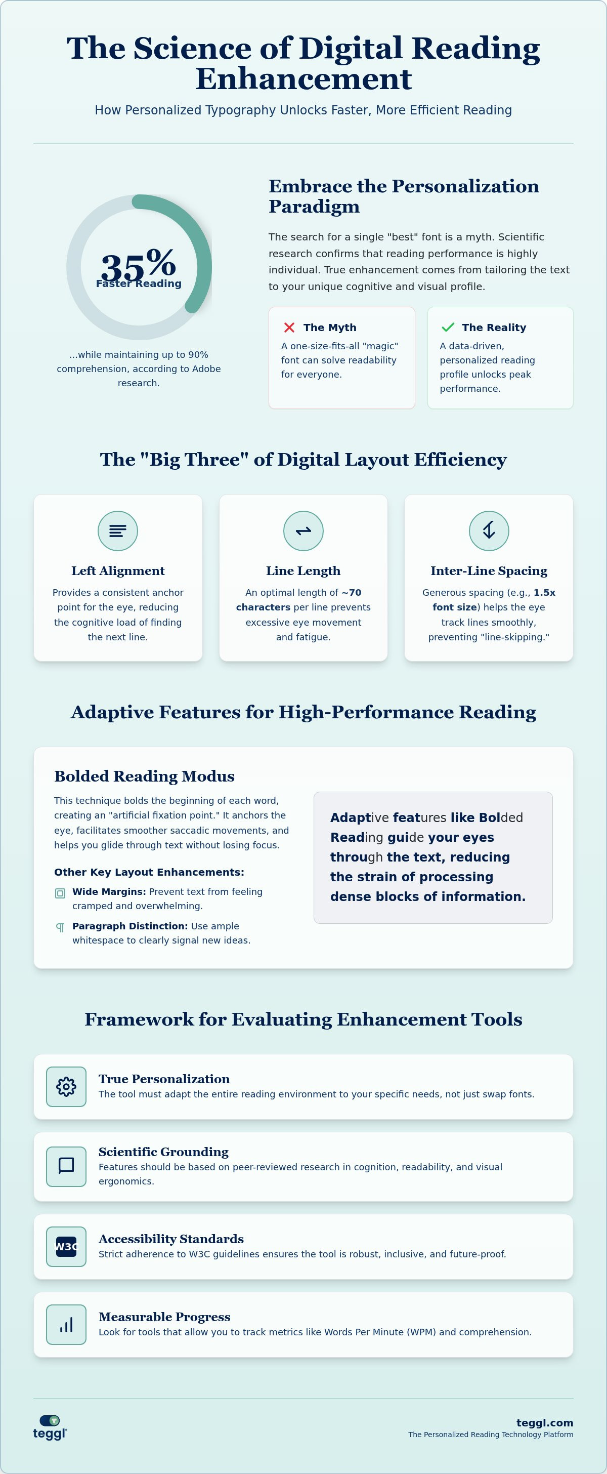
Web page reading enhancement is the strategic optimization of digital text to align with human cognition and visual ergonomics. It's about more than just aesthetics; it's about reducing the friction between the screen and your brain. Efficiency is the goal. By applying The Science of Digital Readability, we can transform how we process information. Adobe research validated the "Personalization Paradigm," showing that readers can achieve a 35% increase in speed while maintaining 90% comprehension when using their optimal font.
There's no magic bullet typeface. Research from the University of Leeds and the University of Essex confirms that no single font, including specialized options like Dyslexie or OpenDyslexic, provides a universal benefit. In fact, studies often show conflicting results for these specific fonts. Your peak performance depends on a combination of factors unique to your visual processing system. True web page reading enhancement requires a data-driven, individual approach rather than a one-size-fits-all solution.
Moving Beyond Static Typography: Why Personalization Matters
Static typography assumes every reader's eyes work the same way. In reality, variables like x-height, character width, and letter spacing interact constantly with your vision. Personalization is the key. Essex University research into "visual crowding" shows that for many, especially those with ADHD or dyslexia, letters can appear to merge in dense blocks. While a larger x-height can boost comprehension by 9% for some, it might not help others. This is why a Reading Profile Test is essential. It moves you away from generic presets and identifies the exact settings that reduce your cognitive load. By personalizing your environment, you turn digital reading into a high-performance activity.
Core Variables for Effective Web Page Reading Enhancement
Success in web page reading enhancement relies on mastering the structural layout of your text. Research from the University of Leeds identifies the "Big Three" variables essential for digital efficiency. First, aim for a line length of approximately 70 characters to prevent eye fatigue. Second, set inter-line spacing to 14pt for 10.5pt text. Finally, stick to left-alignment. These adjustments are the foundation of effective web page reading enhancement, turning dense articles into manageable streams of data that your brain can process with ease.
Environmental factors like contrast and screen quality also dictate your reading stamina. Poor contrast forces your brain to work harder just to identify characters, leading to rapid cognitive exhaustion. Adhering to the Web Content Accessibility Guidelines isn't just about compliance; it's about creating a high-performance workspace that respects your visual limits and physical well-being.
The Role of Adaptive Features: Bolded Reading and Spacing
Static text often causes "line-skipping," where you lose your place in dense articles. Teggl's Bolded Reading Modus addresses this by bolding the start of words to anchor the eye. This technique facilitates smoother saccadic movements, helping you glide through sentences without losing focus. It's helpful to understand the difference between bionic and bolded styles by reviewing this guide on Reading Comprehension Tools.
To reduce online reading distractions, prioritize these layout elements:
Wide Margins: Prevent text from feeling cramped and overwhelming.
Paragraph Distinction: Use white space to signal new ideas clearly.
Consistent Weight: Avoid jarring shifts in font thickness that disrupt flow.
You can start optimizing your experience today by using the Teggl Browser Extension to find your ideal settings.
Evaluating Reading Enhancement Tools: A Framework for 2026
Choosing the right tool requires a sophisticated framework for digital readability. You shouldn't settle for static extensions that simply swap one font family for another. These basic tools often ignore the complex interplay of spacing, x-height, and character weight. True web page reading enhancement comes from adaptive platforms that adjust your entire digital environment in real-time. Effective tools must prioritize scientific grounding, seamless browser integration, and strict adherence to W3C accessibility standards to ensure they provide a reliable, long-term solution for information processing.
Measuring your progress is essential for continuous improvement. Focus on a holistic set of metrics to evaluate any new tool:
Reading Speed: Track your Words Per Minute (WPM) to see measurable gains.
Comprehension: Ensure you maintain high retention levels, ideally 90% or above.
Visual Comfort: Use a subjective scale to monitor eye strain and cognitive fatigue during long sessions.
Integrating Teggl: From Profile Testing to Optimal Performance
Use the Teggl Reading Profile Test to build your foundation. This diagnostic tool moves beyond guesswork by establishing your unique baseline settings. Once identified, the Teggl Browser Extension applies these variables across any live website you visit. It transforms standard HTML into a high-performance, personalized workspace. This evidence-based approach to web page reading enhancement ensures technology finally catching up to your individual needs. We encourage you to compare your reading speed before and after setup. Seeing the impact of adaptive typography first-hand confirms that you've removed the invisible obstacles to peak cognitive performance.
Master Your Digital Reading Environment
Digital overload doesn't have to be your default state. By moving away from static fonts and embracing an adaptive system, you transform how your brain processes information. You've learned that web page reading enhancement isn't about finding a single "best" font; it's about fine-tuning line length, spacing, and contrast to match your unique cognitive profile. Peer-reviewed research from Adobe proves that this level of personalization can yield speed gains of up to 35% while keeping your comprehension intact.
It's time to stop fighting against poorly designed layouts and start working with a W3C-compliant solution that respects your visual stamina. Take the Teggl Reading Profile Test and discover your optimal settings to see exactly how your performance changes when the text adapts to you. You're just one test away from a faster, more comfortable digital experience.
Frequently Asked Questions
Can a personalized font really improve my reading speed by 35%?
Adobe research confirms that readers can achieve up to 35% faster speeds when using their personally optimal font. This gain occurs without a loss in comprehension, which typically stays around 90%. Because everyone processes visual information differently, matching your unique cognitive profile to a specific typeface removes the friction that slows you down during digital navigation.
Does OpenDyslexic or Dyslexie font actually help with reading accuracy?
Independent peer-reviewed studies show no measurable improvement in reading speed or accuracy when using OpenDyslexic or Dyslexie font compared to standard fonts like Arial. While these designs aim to reduce letter reversals, most participants in large-scale experiments actually prefer conventional typefaces. Effective web page reading enhancement relies on personalizing multiple variables like spacing and size rather than relying on a single specialized font.
Is there a universal 'best font' for people with ADHD or dyslexia?
Scientific evidence indicates there's no single font that works for everyone. Reading performance is a result of multiple interacting variables, including x-height, character weight, and screen quality. Instead of a universal solution, an adaptive typography platform that allows for individual adjustments is more effective. You should use a Reading Profile Test to identify which specific settings minimize your personal cognitive load and visual stress.
How do typographic layout variables like line length affect reading efficiency?
Layout variables are just as critical as the font itself for maintaining focus. Research from the University of Leeds suggests an ideal line length is about 70 characters. If lines are too long, your eyes struggle to find the start of the next row. Combining proper line length with generous inter-line spacing and left-alignment creates a legible structure that significantly boosts your overall reading efficiency.
Comments