
Personalized Reading Style Test: Optimize Your Digital Focus and Speed in 2026
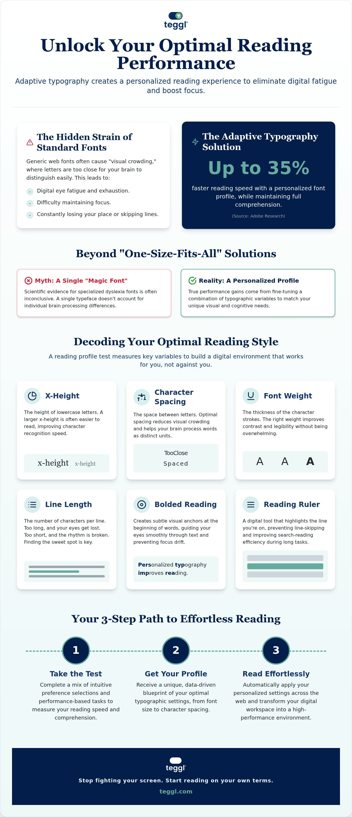
Did you know that simply changing the way a font appears on your screen can increase your reading speed by up to 35% without losing a single detail? You've likely felt the sting of digital fatigue after hours of staring at generic, crowded browser fonts that make your eyes wander and your focus slip. It's frustrating to constantly lose your place or skip lines when you're just trying to work. A personalized reading style test is the first step toward reclaiming your focus and protecting your visual well-being.
This guide explains how adaptive typography uses individual visual profiles to boost efficiency and meet the latest 2026 accessibility standards. You'll discover how to optimize your digital environment to read faster, stay sharper, and finally end the cycle of screen-induced exhaustion. It's time to stop fighting against your screen and start reading on your own terms.
Table of Contents
The Science of Personalized Readability: Why Your Brain Needs a Custom Typographic Profile
While most online quizzes focus on book recommendations, a personalized reading style test serves a much more functional purpose. It's a precise diagnostic tool used to identify the specific typographic variables that maximize your individual reading speed and comfort. By measuring how you process information in real time, this test creates a custom blueprint for your digital environment. It moves the focus away from what you're reading and places it squarely on how your brain actually perceives text.
Believing in a "one size fits all" approach to typography is a common mistake. Adobe Research has demonstrated that readers can increase their speed by up to 35% simply by switching to their personally optimal font, all while maintaining full comprehension. Exploring The Science of Readability reveals that standard web fonts often cause visual crowding, where letters appear too close together for the brain to distinguish them quickly. This effect makes text feel "noisy" and exhausts your cognitive resources, which is especially draining for those navigating ADHD or dyslexia traits.
To see how these tests are evolving to understand individual habits, watch this helpful video:
Beyond Dyslexia Fonts: What the Research Actually Says
Scientific evidence for specialized fonts like Dyslexie or OpenDyslexic remains inconclusive. Many peer-reviewed studies indicate they don't necessarily outperform standard fonts like Arial or Times New Roman. Contrast this with findings from the University of Essex, which showed Verdana outperforming Sassoon Primary by 5% to 9% in reading speed. The key isn't a single "magic" typeface. Results from a personalized reading style test show that performance depends on adaptive typography, which means fine-tuning character spacing, x-height, and font weight. This data-driven approach ensures your digital interface supports your brain's natural processing style rather than forcing it to adapt to rigid, outdated standards.
Inside the Teggl Reading Profile Test: Quantifying Your Optimal Visual Settings
The Teggl Reading Profile Test moves beyond simple aesthetic choice. It's a modular assessment designed to bridge the gap between visual preference and measurable performance. We start with intuitive selections where you choose what feels comfortable. Then, the test transitions into performance-based data, measuring your reading rate and comprehension across diverse typographic configurations. This ensures your results are grounded in how your brain actually processes text.
By adhering to W3C standards and current accessibility guidelines, we ensure our parameters are inclusive for every user. We've integrated the principles of Personalized Typography to remove the friction found in standard browser displays. Using a personalized reading style test allows you to move from generic settings to a workspace that respects your unique cognitive needs.
Key Variables Measured: From X-Height to Bolded Reading
Lowercase letter height, known as x-height, is a critical factor for both early and adult readers. Research from the University of Leeds shows that x-height and line length are deeply linked to how efficiently our eyes move across a page. Our assessment evaluates this alongside font weight and character spacing. We also analyze the impact of bolded reading modus, which uses subtle visual anchors to keep your focus from drifting through dense paragraphs.
This assessment also identifies your optimal "Reading Ruler" effect. This digital tool prevents line-skipping and improves your search-reading efficiency during long workdays. It's a foundational component of modern reading comprehension tools. You can discover your unique settings and transform your digital workspace into a high-performance environment today.
Applying Your Reading Profile: How Adaptive Typography Enhances Digital Performance
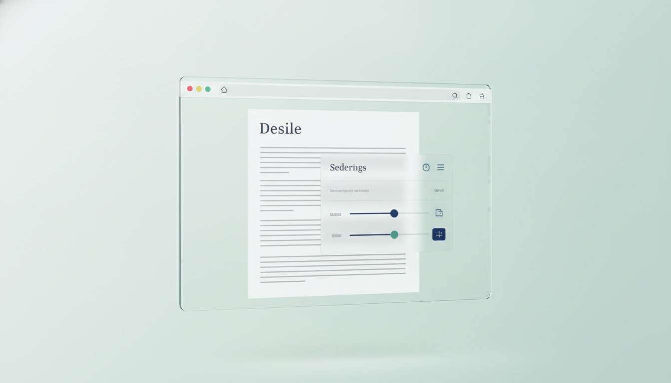
Once you complete the personalized reading style test, the results shouldn't sit in a static report. The Teggl Browser Extension transforms those data points into a functional reality by automatically applying your unique profile to every website you visit. This creates a seamless, polished environment where the technology adapts to you. It's a fundamental shift away from forcing your brain to struggle with rigid, generic web designs.
A standout feature of this transition is the Bolded Reading Mode. It enhances specific focus points within words to guide your eye through dense digital text with precision. This method prevents the "drifting" sensation often felt during long research sessions. Research from the School of Design at the University of Leeds highlights that proper spacing and contrast significantly reduce cognitive load. By optimizing these factors, Teggl acts as a visionary ally in the fight against digital overload, ensuring your professional reading environment remains sharp and accessible.
Adaptive Typography in Action: Reducing Digital Fatigue
To transform your browser into a high-performance tool, consider these research-backed settings often identified during a personalized reading style test:
Maintain line lengths of approximately 70 characters for optimal visual tracking.
Utilize wide margins to provide essential "breathing room" for the brain.
Adjust inter-line spacing to prevent visual crowding and accidental line-skipping.
We address digital exhaustion with a clear framework. The problem is static, exhausting web design. The solution is adaptive typography. The benefit is sustained focus and faster reading speeds. Integrating these settings into your daily workflow ensures that your digital environment supports both your physical well-being and your peak productivity goals.
Master Your Digital Environment in 2026
The era of struggling against static, crowded web fonts is over. By identifying the specific typographic variables that resonate with your visual profile, you can unlock faster reading speeds and deeper focus. Evidence from Adobe and university research confirms that personally optimal settings are the key to reducing cognitive load and ending digital fatigue. Professionals around the world are already using these adaptive tools to transform their workspaces into high-performance environments. Taking a personalized reading style test is the essential first step toward a more comfortable and efficient digital life. It's time to stop settling for generic browser defaults and start prioritizing your visual well-being. Take the Teggl Reading Profile Test and Optimize Your Browser to experience the power of adaptive typography through our free browser extension. You deserve a reading experience that works as hard as you do.
Frequently Asked Questions
How does a personalized reading style test differ from a standard speed reading test?
A personalized reading style test focuses on identifying the specific typographic variables that maximize your individual performance, whereas a standard speed reading test only measures words per minute. Instead of just timing you, our assessment analyzes how character spacing, font weight, and x-height affect your comprehension. It's a way to create a custom profile that adapts digital text to your unique needs.
Can a personalized font really increase my reading speed by 35%?
Yes, peer-reviewed research from Adobe demonstrates that individuals can read up to 35% faster when using their personally optimal font without losing comprehension. This improvement happens because the text is matched to your specific visual profile. By using a personalized reading style test, you'll remove the cognitive obstacles created by generic fonts, allowing for a much more efficient and comfortable reading experience.
Is there a single best font that everyone should use for online reading?
No single font works for everyone, which is why personalization is essential. While some research shows Verdana outperforms Sassoon Primary by 5-9%, Adobe Research confirms that the "best" font varies significantly between individuals. We don't promote a single "magic" typeface; instead, we focus on adaptive typography. Your optimal setting is unique to your visual profile and environmental factors.
How does the Teggl test help with visual crowding and digital eye strain?
The Teggl test identifies your sensitivity to visual crowding, where characters appear too close together and exhaust the brain. Our tool addresses this by applying Bolded Reading Mode and specific spacing adjustments based on your results. These functional remedies create clear visual anchors and reduce cognitive load. This approach follows University of Leeds research on legible layouts to help you maintain focus and minimize digital fatigue.
Comments