
Visual Text Processing Tool: A Comprehensive 2026 Guide to Digital Readability
What if the reason you're struggling to finish that report isn't a lack of discipline, but a failure of your screen's typography to speak your brain's language? Most of us accept digital eye strain as the inevitable tax for living in a text-heavy world. You've likely felt that mental fog after an hour of scrolling through dense, unoptimized layouts. A modern visual text processing tool addresses these pains by aligning digital text with your cognitive strengths, allowing you to process information without the usual friction.
This guide shows you how evidence-based typography and cognitive science can transform your digital reading speed and comprehension. You'll discover how to reduce mental fatigue and reclaim focus by moving beyond standard web layouts. We'll explore the latest 2026 advancements in Vision Language Models and show you how to create a personalized reading environment that fits your unique visual needs.
Table of Contents
What is a Visual Text Processing Tool? From Machine Vision to Human Readability
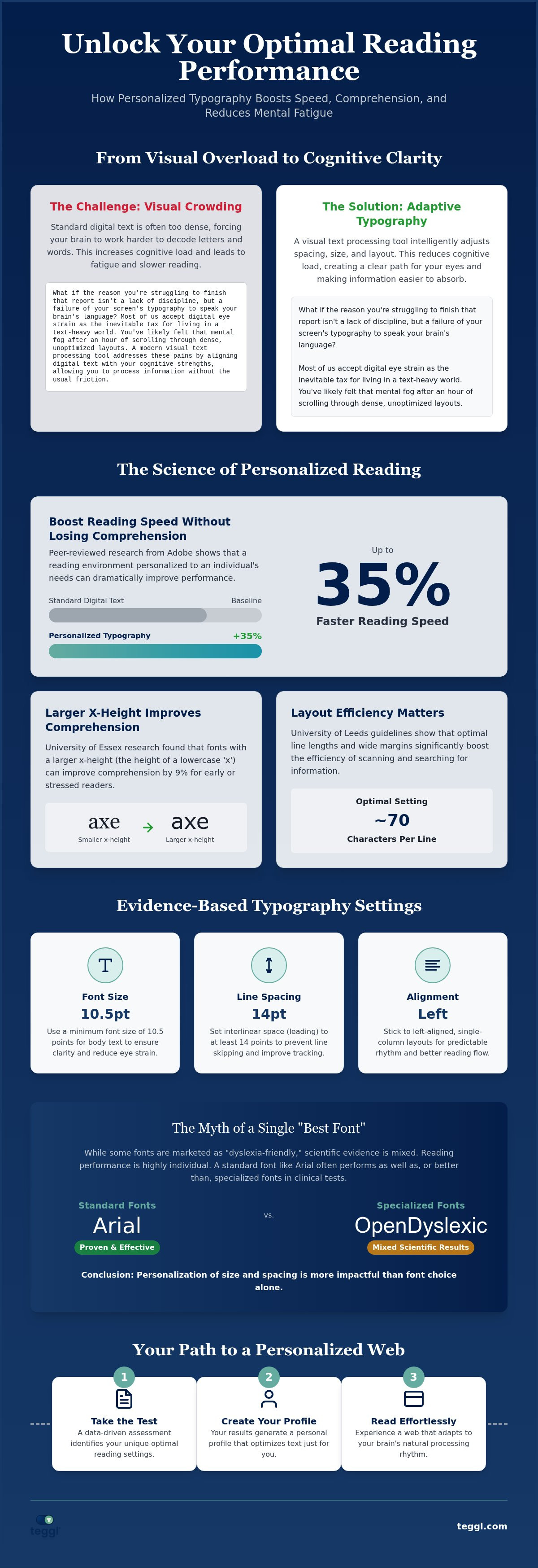
Many people associate text processing with Optical Character Recognition (OCR). In 2026, the leading edge of this field involves Vision Language Models (VLMs) that can reason over complex documents. However, a modern visual text processing tool for everyday users serves a different master: the human brain. Unlike machine-facing tools that prioritize data extraction, these platforms adapt digital text displays to improve Readability and cognitive processing. They treat text as a dynamic interface rather than a static element.
A core function of these tools is mitigating "visual crowding." This occurs when letters or words are too close together, causing the brain to struggle with decoding. By intelligently adjusting spacing, contrast, and font weight, a visual text processing tool reduces cognitive load. It transforms a dense paragraph into a clear, navigable path for the eyes. This shift prioritizes sensory comfort and efficiency over rigid design standards, making information easier to absorb.
The Evolution of User-Centric Text Manipulation
We've moved past the era of static web fonts. Current W3C standards and WCAG 2.2 guidelines are driving a shift toward inclusive, adaptive typography platforms like bolded reading modus. These innovations recognize that standard layouts often exhaust the brain. For individuals with ADHD or dyslexia, static text can lead to rapid mental fatigue. Adaptive tools solve this by providing personalized environments that match individual cognitive profiles, ensuring digital reading feels seamless.
The Science of Text Optimization: Variables That Drive Reading Performance
Research from The Readability Consortium proves that the "best font" is a myth. No single typeface works for everyone. Instead, reading performance depends on individual visual profiles. Adobe's research highlights this impact, showing that personalized fonts can increase reading speed by up to 35% without any loss of comprehension. A sophisticated visual text processing tool leverages these findings to adapt text to the reader's eyes. For example, the University of Essex found that larger x-heights of approximately 5.0mm improve comprehension by 9% in early or stressed readers.
Research-Backed Factors: Font Size, Spacing, and Layout Efficiency
Layout choices are just as critical as font selection. University of Leeds guidelines suggest that line lengths of 70 characters combined with wide margins significantly boost search-reading efficiency. Character width and weight also play a role. Studies show Verdana's superiority over Sassoon Primary in specific visual search tasks due to its generous spacing. While some users prefer "dyslexia-friendly" fonts like Dyslexie or OpenDyslexic, peer-reviewed research shows mixed results. These fonts often provide no significant advantage over standard Arial.
To optimize your digital experience, you should aim for these evidence-based settings:
Use a minimum 10.5pt font size for clarity.
Set interlinear space to 14pt to prevent line skipping.
Stick to left-aligned, single columns for better flow.
You can take a Reading Profile Test to identify which of these specific variables work best for your unique cognitive style. This data-driven approach ensures your visual text processing tool delivers maximum performance without the guesswork.
Implementing Adaptive Typography: How Teggl Personalises the Web
Transitioning from theory to practice requires a versatile visual text processing tool that integrates seamlessly into your daily workflow. The Teggl Browser Extension serves as this practical application, moving beyond static font choices to provide a comprehensive, adaptive typography platform. It acts as a visionary ally, removing the visual obstacles that lead to digital burnout and fragmented attention. By treating the web as a flexible interface, it ensures that technology finally meets your individual requirements.
The journey starts with the Reading Profile Test. This data-driven assessment moves away from guesswork by identifying your unique optimal reading settings based on your specific visual response. Instead of relying on generic browser defaults, you discover the exact combination of x-height, spacing, and contrast that maximizes your cognitive efficiency. This personalized approach ensures that the digital environment supports your brain's natural processing rhythm.
Once your profile is active, features like Bolded Reading Mode guide your eyes through dense digital environments. By strategically emphasizing specific character weights, the tool helps you maintain focus and reduces the likelihood of skipping lines during long research sessions. It's a sophisticated way to navigate information overload without the usual mental strain.
Creating Your Reading Profile: The Path to Cognitive Efficiency
You can transition from "default" reading to a personalized experience in three simple steps. First, install the extension. Second, complete the profile test to calibrate the interface to your visual needs. Third, activate the customized settings across your favorite websites. This process prioritizes your sensory comfort and physical well-being alongside speed gains. We encourage you to compare your performance before and after using this visual text processing tool. You'll likely find that the reduction in mental fatigue after a full workday is just as transformative as the increase in your reading speed.
Reclaim Your Digital Focus
The shift from static web layouts to adaptive typography is more than a design trend; it's a cognitive revolution. We've seen how a visual text processing tool uses variables like x-height and line length to align digital content with your brain's unique processing patterns. Research proves that personalization is the key to efficiency, with customized fonts potentially boosting reading speed by 35%. You don't have to settle for layouts that cause eye strain or mental fatigue. By utilizing an evidence-based platform aligned with university research, you can transform your screen into a high-performance workspace.
Try the Teggl Browser Extension and discover your optimal reading profile today. It's time to experience the clarity and relief that comes with a reading environment designed specifically for you.
Frequently Asked Questions
Can a visual text processing tool really improve my reading speed?
Yes, a visual text processing tool increases speed by removing the visual friction that triggers cognitive slowdown. Research from Adobe indicates that when typography is tailored to the individual, reading speed can improve by up to 35%. These tools allow you to bypass the limitations of generic web design, providing a streamlined experience where your eyes move faster and your brain retains more.
Is there one specific font that is best for everyone?
No single font is universally the best for every person. The Readability Consortium's research highlights that typographic preference is deeply personal and varies based on individual visual profiles. Instead of searching for a "magic" font, it's more effective to use technology that lets you adjust multiple variables like character weight and spacing to find what feels most comfortable for your eyes.
How do larger font sizes affect comprehension for children and adults?
Larger font sizes and increased x-heights generally aid comprehension by reducing visual crowding. University research has shown that specific adjustments, like a 5.0mm x-height, can improve comprehension by 9% for certain readers. While adults might prefer smaller text for efficiency, a visual text processing tool ensures that both children and adults can find the specific scale that prevents mental fatigue during deep reading.
Does a visual text processing tool help with ADHD or dyslexia?
While these tools don't cure ADHD or dyslexia, they significantly reduce the visual strain and focus loss often associated with these conditions. By using features like Bolded Reading Mode, users can create a high-contrast path for their eyes to follow. This helps minimize the "line skipping" and mental exhaustion that occurs when trying to process unoptimized, dense digital text on standard web pages.
Comments