
The Science of Bolded Reading Mode: Optimizing Digital Readability in 2026
Did you know that personalizing your font settings can increase your reading speed by up to 35% while maintaining focus? Most of us spend our days fighting against static web fonts that weren't designed for our specific neurological needs. You've likely felt that familiar cognitive exhaustion or found yourself skipping lines as your eyes struggle to track text on a glowing screen. It's an exhausting way to work. This guide explores how a personalized bolded reading mode leverages neuro-typographical research to transform your digital experience into something fluid and effortless. We'll dive into the latest 2026 research on visual fixation, examine why scientific studies often show mixed results, and show you how to build a reading profile that actually fits your brain.
Table of Contents
The Science of Visual Attention and Bolded Reading Mode
The mechanics of reading involve a complex series of rapid eye movements known as saccades, punctuated by brief moments of stillness called fixations. During these fixations, the brain processes visual information to identify letters and words. A bolded reading mode serves as a typographical intervention designed to optimize this process. By emphasizing the initial characters of a word, it creates a high-contrast anchor that guides the eye’s foveal vision directly to the most informative part of the string. This technique seeks to minimize the time spent on each fixation, allowing for a more efficient transition across the line of text. It is a modern evolution of concepts found in The Science of Speed Reading, focusing on the reduction of sub-vocalization and the expansion of the visual span.
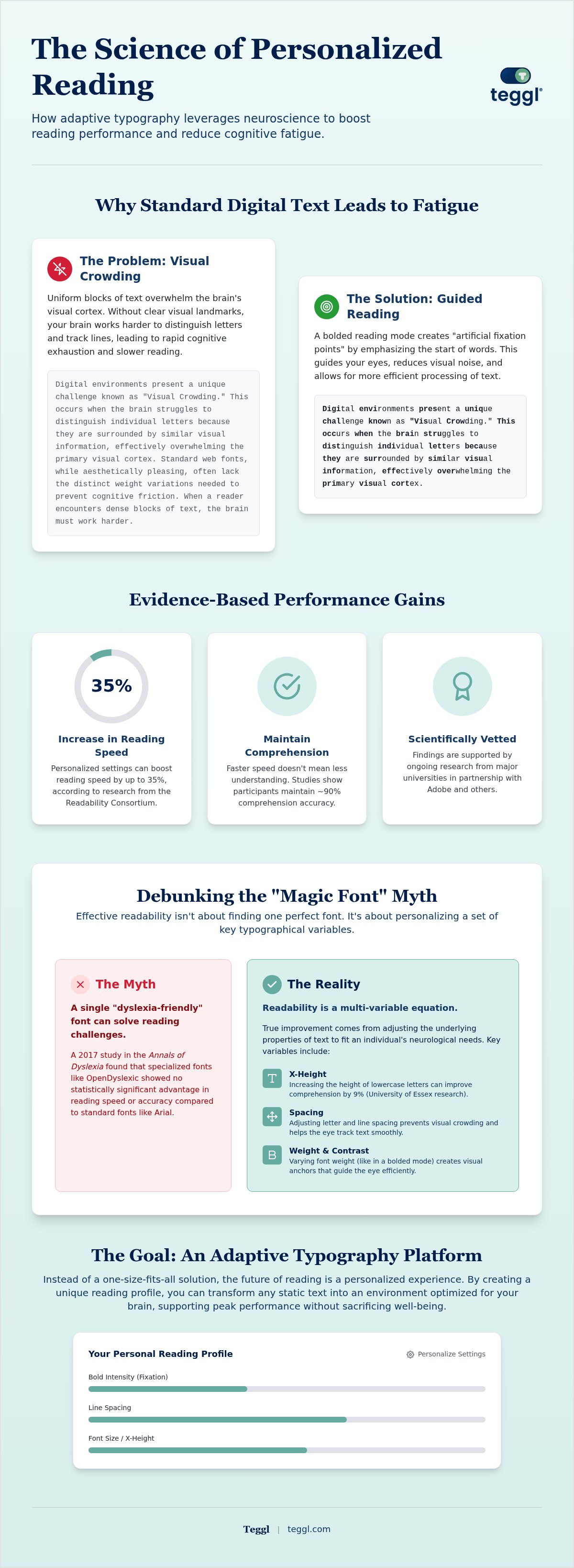
Digital environments present a unique challenge known as "Visual Crowding." This occurs when the brain struggles to distinguish individual letters because they are surrounded by similar visual information, effectively overwhelming the primary visual cortex. Standard web fonts, while aesthetically pleasing, often lack the distinct weight variations needed to prevent this cognitive friction. When a reader encounters dense blocks of text without clear visual landmarks, the brain must work harder to maintain its place and process word shapes. This increased mental effort leads to rapid cognitive exhaustion, particularly during long-form reading sessions. By utilizing a bolded reading mode, we can break the monotony of the text block, providing the brain with the "artificial fixation points" it needs to navigate complex sentences without the weight of visual crowding.
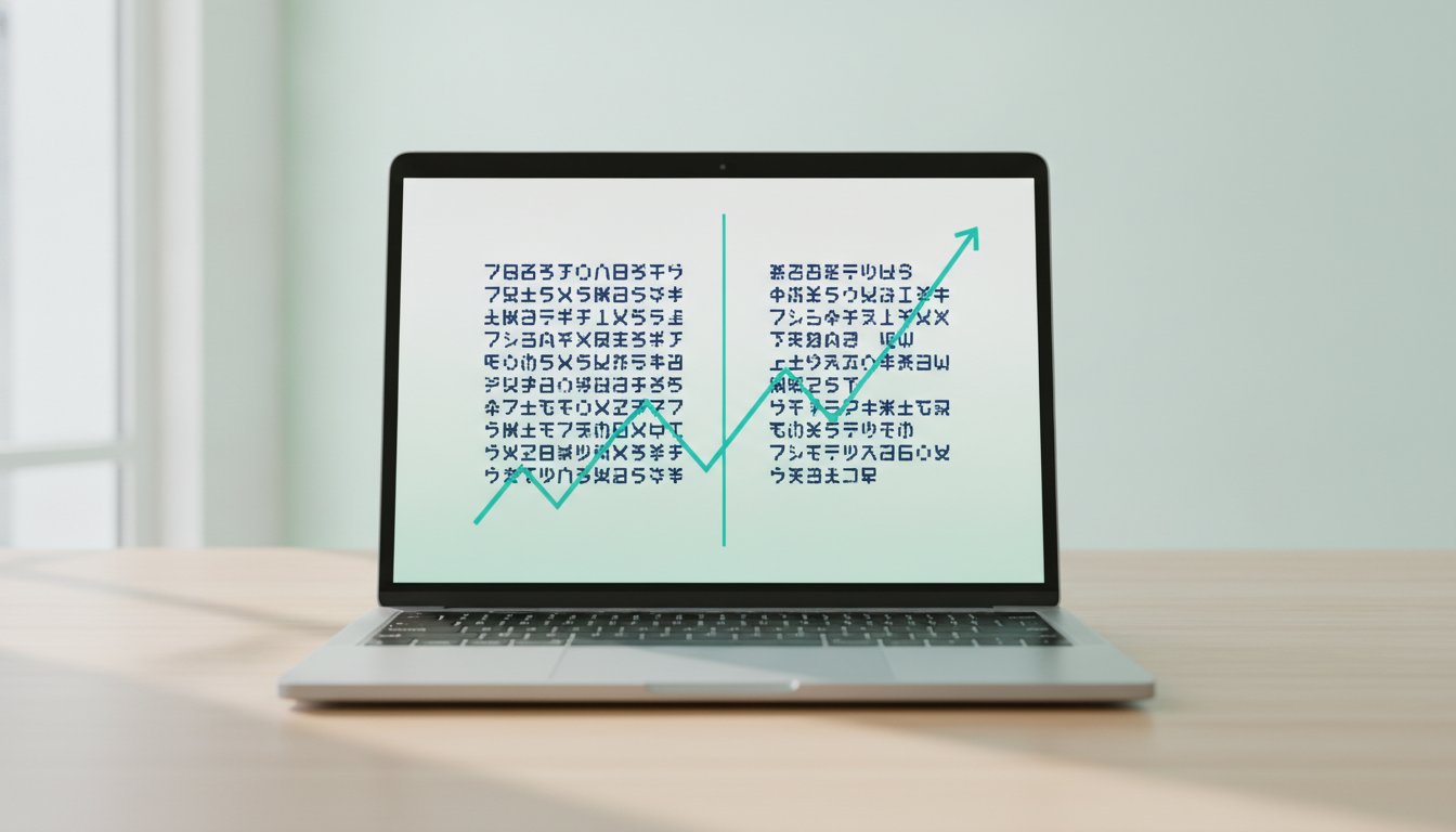
Evidence for the benefits of typographical personalization is growing within the scientific community. Research conducted by the Readability Consortium, in partnership with Adobe and several major universities, highlights that there is no universal "best" font for everyone. Their 2022 and 2023 studies demonstrated that when participants used font settings tailored to their specific visual needs, they experienced reading speed increases of up to 35%. Crucially, these gains did not come at the expense of comprehension; participants maintained roughly 90% accuracy in understanding the material. This research underscores the reality that reading is a highly individual neurological task. What works for a professional scanning a technical manual may not work for a student reading a narrative essay, making the ability to toggle and calibrate bolded text essential for peak performance.
Debunking the 'Magic Font' Myth for Dyslexia and Focus
The search for a single, proprietary typeface that can "fix" reading challenges like dyslexia or ADHD often leads to marketing-heavy claims that lack rigorous scientific backing. For years, specialized fonts were marketed as the primary solution for neurodivergent readers. however, a 2017 study published in the Annals of Dyslexia compared the performance of OpenDyslexic against standard fonts like Arial and Times New Roman. The results showed no statistically significant advantage for the specialized font in terms of reading speed or error reduction. This suggests that the "magic" isn't in the specific shape of the letters, but in the underlying typographical variables that govern how those letters are presented on a screen.
Research from the University of Essex further clarifies this by shifting the focus to x-height and letter spacing. Their findings indicated that increasing the x-height (the height of lowercase letters relative to uppercase ones) to approximately 5.0mm improved comprehension by 9% across a diverse group of readers. This improvement occurred regardless of whether the font was a serif or sans-serif style. It proves that readability is a multi-variable equation involving weight, contrast, and spacing. Instead of relying on a single "best" font, an adaptive typography platform allows users to manipulate these variables dynamically. A bolded reading mode is a powerful component of this equation, but it must work in harmony with line length and x-height to create a truly accessible digital environment.
When we look at the broader landscape of visual ergonomics, it becomes clear that the goal is not to "cure" a condition but to remove the environmental obstacles that hinder performance. By understanding the science of visual attention, we move away from static, one-size-fits-all layouts toward a future of personalized readability. This shift acknowledges that every brain processes information differently, and our technology should be flexible enough to meet those individual needs without sacrificing scientific integrity.
How to Personalize Your Bolded Reading Experience
Optimization is a data-driven process that begins with understanding your current visual performance. Before activating a bolded reading mode, it's essential to identify your baseline reading speed and comprehension levels through a standardized assessment. This prevents the "placebo effect" where a new font feels faster simply because it's different. Once you have a baseline, you can begin the calibration process. Calibration involves adjusting two primary variables: fixation and saccade. Fixation refers to the specific number of bolded characters at the start of each word, while saccade refers to the frequency of bolded words throughout a sentence. Because every reader's foveal vision covers a different number of characters, these settings must be precision-tuned to match your specific visual span.
The following table illustrates the difference between a generic, one-size-fits-all approach and a personalized setup based on evidence-based typography:
Layout variables play an equally critical role in reading efficiency. Research from the University of Leeds emphasizes that even the most advanced bolding algorithm can be undermined by poor line management. For maximum efficiency, readers should aim for a line length of approximately 70 characters. This width is narrow enough to prevent the eye from losing its place during the "return sweep" to the next line, yet wide enough to allow for meaningful context. Citing The Science of Bolded Print, we find that while bolding impacts visual preference and can aid in word recognition, it performs best when integrated into a holistic reading environment that accounts for spacing and contrast.
Optimizing Layout Variables for Neurodivergent Readers
For readers with ADHD or other neurodivergent traits, the primary challenge is often "line skipping" or losing focus during the transition between sentences. To combat this, personalize your inter-line spacing to at least 14pt. This extra vertical breathing room creates a clear "path" for the eyes to follow. Additionally, always prioritize left-aligned single columns over justified text. Justified text creates irregular gaps between words, known as "rivers of white," which can be highly distracting and break the flow of a bolded reading mode.
Modern reading comprehension tools in 2026 must also account for the physical hardware used for reading. Screen quality, refresh rates, and blue light levels all impact how bolded characters are perceived. To create a truly distraction-free digital environment using Teggl’s adaptive typography settings, follow this setup checklist:
Increase line spacing to 1.5x or 2.0x to reduce visual crowding.
Ensure your monitor's contrast is set to a "warm" or "sepia" tone to reduce glare on bolded anchors.
Disable sidebar notifications and auto-play videos to preserve your cognitive budget.
Limit the total width of the text container to 800 pixels to maintain the 70-character rule.
By treating typography as a dynamic system rather than a static choice, you transform the act of reading from a chore into a high-performance activity. You can start this journey by taking our Reading Profile Test to discover the exact settings that align with your brain's processing patterns.
The Cognitive Benefits of Adaptive Typography with Teggl
Teggl’s bolded reading modus isn't just a visual layer. It represents a fundamental shift in how digital information is processed by the human brain. By moving away from generic algorithms, the Reading Profile Test creates a scientifically calibrated tool tailored to your unique visual span. This approach is supported by recent Adaptive Typography Research, which explores how variable font grades significantly impact reading comfort. When you activate a personalized bolded reading mode, you reduce the mental effort required to identify words. This frees up cognitive resources for higher-level analysis and critical thinking. Sustained focus becomes the standard for deep-work sessions, effectively preventing the common digital burnout effect that occurs when the brain is forced to process unoptimized, static text for hours on end.
Setting Up Your Personalized Reading Environment
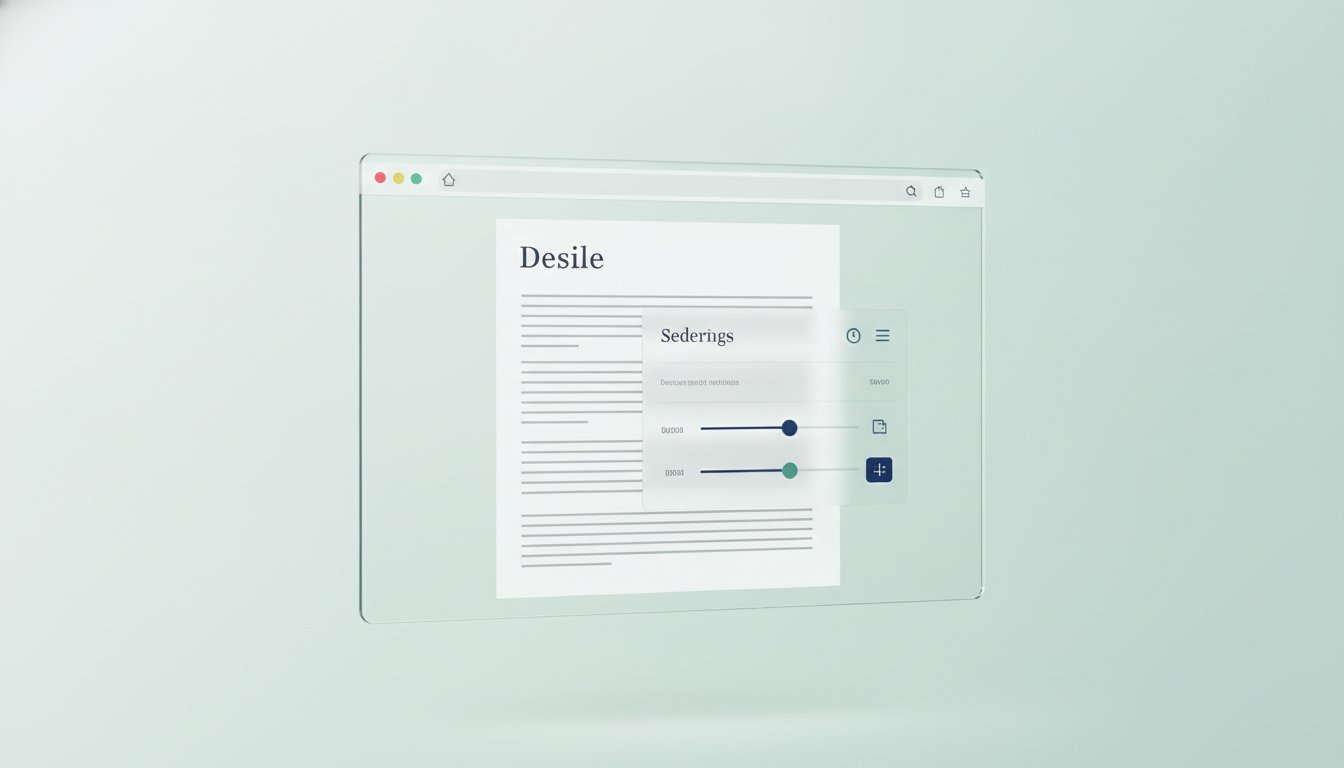
Start by installing the Teggl browser extension to begin your optimization journey. Your first step is a performance assessment to identify your baseline speed and comprehension levels. Once your profile is ready, you can apply bolded reading mode to any text-heavy webpage or document instantly. For professionals scanning academic journals or technical reports, Teggl’s 'Z-pattern' guidance improves search-reading efficiency by highlighting key anchors in a logical flow. This allows you to navigate complex data quickly without losing the thread of the argument or skipping vital information. We invite you to discover your optimal reading settings today and see how your performance compares to baseline standards. It's time to build a reading environment that works with your brain rather than against it.
Master Your Digital Focus
Digital overload doesn't have to be your baseline. By moving from static fonts to a personalized bolded reading mode, you align your reading environment with your brain's unique visual processing needs. Research from Adobe and The Readability Consortium shows that these personalized settings can help you read up to 35% faster. It's an evidence-based accessibility solution that protects your mental energy during intense deep-work sessions. You've seen the science behind visual fixation and layout calibration. Now, it's time to put those insights into practice. Don't settle for a one-size-fits-all digital experience when a calibrated profile is within reach. Take the Reading Profile Test and Optimize Your Reading Speed on Teggl.com to discover the settings that unlock your peak performance. Your eyes, and your brain, will thank you for the clarity.
Frequently Asked Questions
Does bolded reading mode actually help with ADHD and Dyslexia?
It functions as an adaptive accessibility tool that may reduce cognitive load for neurodivergent readers, though it isn't a cure. A 2024 study suggests it supports better focus for individuals with ADHD by helping them make sense of sentences at higher speeds. However, research results are mixed, and effectiveness often depends on personalizing other variables like line spacing and contrast ratios.
Is there a difference between Bionic Reading and Teggl's Bolded Reading?
The main difference is the shift from a static algorithm to evidence-based personalization. Bionic Reading is a specific patented brand, while Teggl is an adaptive typography platform. Teggl uses a Reading Profile Test to calibrate settings to your unique visual span. This ensures that the bolding patterns are scientifically tailored to your brain rather than applied as a one-size-fits-all filter.
What does the research say about the effectiveness of bolded fonts?
The scientific community reports conflicting results regarding these techniques. While some 2024 studies found no significant speed increase for general populations, Adobe research shows that personalized font settings can increase reading speed by up to 35%. This highlights the importance of using a bolded reading mode that is calibrated to your specific needs rather than relying on unoptimized, generic text layouts.
Can I use bolded reading mode on any website?
You can apply these optimizations across the web by using the Teggl browser extension. Once installed, it transforms static text on almost any webpage into a dynamic, accessible experience based on your specific profile. This allows you to maintain your optimal reading environment while scanning academic papers, professional reports, or long articles, ensuring a seamless experience across different digital platforms and screen qualities.
Comments