
The Evolution of Web Browser Focus Modes: Optimizing Digital Reading Performance in 2026
What if the primary obstacle to your productivity isn't the difficulty of the text, but the very tool you use to read it? As we navigate 2026, the gap between standard web design and cognitive ergonomics has never been wider. Most users accept mental fatigue as an inevitable tax on digital life, yet research suggests that a properly configured web browser focus mode for reading can transform this experience entirely. You've likely felt the frustration of sidebars that shift mid-sentence or inconsistent typography that makes tracking lines nearly impossible. These aren't just minor annoyances; they are significant barriers to comprehension and speed.
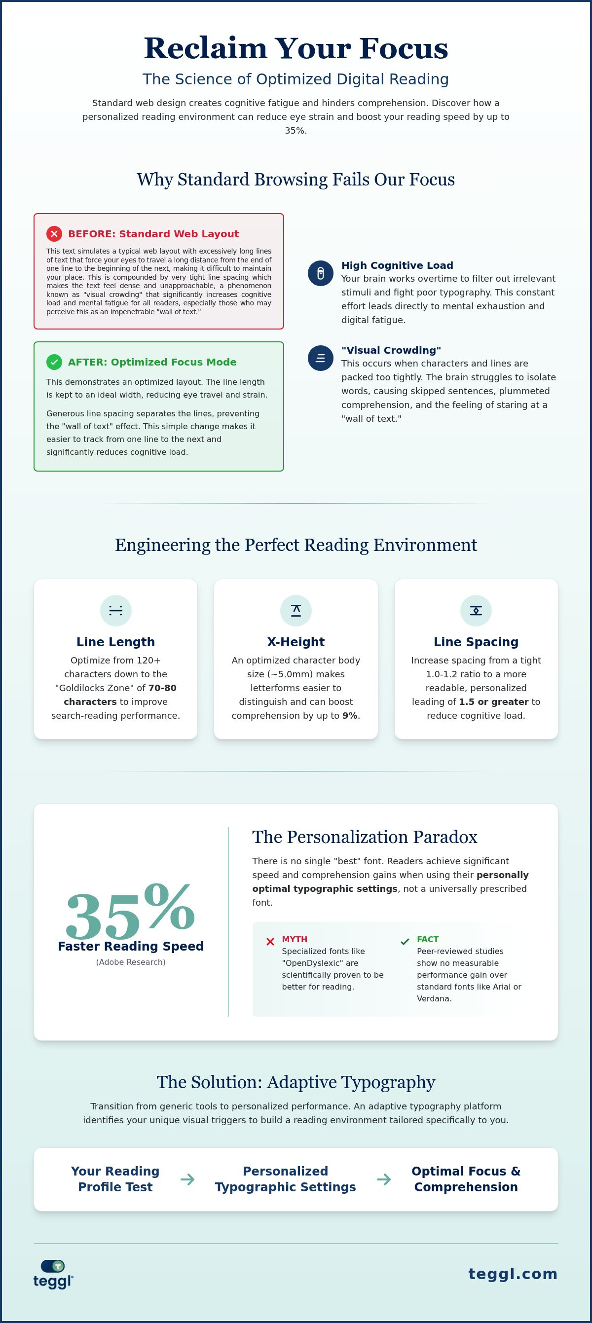
It's time to reclaim your focus. We'll show you how to evolve your browser from a cluttered window into a high-performance reading environment. This guide explores the latest advancements in adaptive typography and cognitive science, moving beyond generic "Reader Views" to personalized setups that match your unique visual profile. You'll discover how to reduce digital eye strain and increase your reading momentum by up to 35% using evidence-based tools. We'll preview the mechanics of visual crowding, the role of x-height, and the practical implementation of bolded reading to help you achieve deep, frictionless focus.
Table of Contents
The Cognitive Cost of Digital Text: Why Standard Browsing Fails Our Focus
In 2026, a web browser focus mode for reading is no longer a simple "distraction-free" button. It functions as a cognitive layer that optimizes text for both neurodiverse and neurotypical readers. Standard web browsing fails because it forces the brain to filter out irrelevant stimuli while fighting poor typography. This creates a high cognitive load that leads to mental exhaustion.
To see how a basic tool can strip away these digital obstacles, watch this helpful video:
A major hurdle addressed by a web browser focus mode for reading is "visual crowding." This phenomenon occurs when standard layouts pack characters too tightly, overwhelming the brain's ability to isolate specific words. For readers with ADHD, this often results in a "wall of text" where lines blur together, causing skipped sentences and plummeted comprehension. While many blame blue light for digital eye strain, the fatigue often stems from poor typographic ergonomics and the effort required to track inconsistent layouts.
Visual Crowding and the Mechanics of Reading Fatigue
Your brain relies on specific ratios of white space and letter density to maintain focus. Paradoxically, high-resolution screens can make standard sans-serif fonts harder to read because the sharp edges increase the cognitive effort needed to distinguish similar letterforms. By applying key principles of readability, you can mitigate this friction. You should also explore how to reduce online reading distractions to refine your environment and protect your cognitive energy.
Engineering the Perfect Reading Environment: Key Variables for Digital Focus
Standard browsers often provide generic font size sliders, but true optimization requires a more granular approach. Research from Adobe reveals a "Personalization Paradox": readers can increase their speed by up to 35% when using their personally optimal font, rather than a single "best" font. This highlights why a generic web browser focus mode for reading often falls short. It's not about finding a universal solution; it's about matching the interface to your specific visual processing style.
Digital environments can have profound effects on cognitive abilities, making specific typographic variables critical for maintaining attention. Leeds research identifies 70 characters as the "goldilocks zone" for line length in academic search-reading. Additionally, a study by the University of Essex found that increasing x-heights to 5.0mm can boost comprehension by 9%. The following table compares standard settings with an optimized environment:
The Personalization Myth: Why One Font Doesn't Fit All
Teggl rejects the "one best font" trap. Instead, we use a Reading Profile Test to identify your unique visual triggers and optimal character widths. While Leeds University guidelines suggest different performance levels for Serif and Sans-Serif fonts, the final choice depends on the individual. Interestingly, peer-reviewed studies show that specialized fonts like OpenDyslexic offer no measurable performance gain over standard fonts like Arial or Verdana. Beyond the font itself, widening margins and adjusting inter-line spacing are essential steps for reducing cognitive load.
Section Takeaways:
Personalization improves reading speed by up to 35% compared to generic settings.
A line length of 70 characters is the high-performance standard for search-reading.
Evidence suggests standard fonts often outperform specialized "dyslexia" fonts when properly scaled.
Implementing an Adaptive Focus Mode: From Generic Tools to Personalized Performance
Native "Reader Views" in browsers like Edge 151 or Safari 26.6 provide a solid foundation by stripping away ads and sidebars. They are effective for basic clutter removal, but they often stop at static layout changes. To truly optimize your digital reading, move beyond generic toggles. A specialized web browser focus mode for reading allows for adaptive typography that responds to your unique cognitive profile. Use a Reading Profile Test to identify your ideal character widths and spacing. This diagnostic approach replaces trial and error with evidence-based settings that feel natural to your eyes, significantly reducing the effort required to track text.
Establishing a "Focus Ritual" further strengthens your performance. Create a dedicated browser profile solely for deep work. By isolating your reading environment from social media logins and distracting bookmarks, you signal to your brain that it's time for high-level information processing. This separation creates a mental boundary that protects your attention from the typical pull of the open web.
Bolded Reading and the Science of Cognitive Momentum
Traditional text often feels stagnant, which leads to "skimming" where you lose the thread of the argument. Bolded Reading solves this by emphasizing the initial parts of words. These visual "anchor points" help your brain predict word endings faster, maintaining cognitive momentum and preventing the "wall of text" fatigue mentioned earlier. It's a bridge from passive scanning to deep reading. For a comprehensive look at these setups, explore our 2026 guide to personalised reading tools. This adaptive typography platform ensures your web browser focus mode for reading evolves with your needs, transforming every page into a frictionless stream of information.
Reclaim Your Digital Attention and Performance
The digital world won't get less crowded, but your experience of it can. By moving beyond generic "Reader Views" and embracing an adaptive typography platform, you eliminate the cognitive friction that leads to burnout. A sophisticated web browser focus mode for reading ensures that every line of text works with your brain rather than against it. Evidence-based research from Adobe, Leeds, and Essex Universities proves that personalization is the ultimate productivity tool. Users often read up to 35% faster when their environment matches their cognitive profile.
Our privacy-first extension is designed to protect your focus without tracking your data. It's time to stop fighting the screen and start flowing through information. Take the Teggl Reading Profile Test to discover your optimal focus settings and experience the clarity you deserve. Your most productive reading sessions are just a few clicks away.
Frequently Asked Questions
What is a web browser focus mode for reading?
It is a digital interface layer designed to strip away distractions and optimize typographic variables. Unlike basic ad-blockers, a modern web browser focus mode for reading adjusts font size, x-height, and line length to match human cognitive limits. This creates a high-performance environment where the brain can process text without the constant interference of cluttered web layouts and inconsistent formatting.
Do specialized fonts like OpenDyslexic actually improve reading speed?
Scientific research shows that specialized fonts like OpenDyslexic or Dyslexie offer no measurable performance advantage over standard fonts like Arial or Verdana. Studies indicate that reading speed is influenced more by personal preference and familiarity than by specific letter designs. Instead of searching for a universal font, focus on adjusting spacing, contrast, and character size to suit your unique visual profile.
Can a personalized font really help with ADHD or dyslexia?
Personalized typography doesn't cure ADHD or dyslexia, but it can significantly reduce the cognitive effort required to read. By optimizing variables like x-height and line spacing, you minimize visual crowding and line-skipping. Findings vary between individuals, but research from Adobe suggests that using a personally optimal font can increase reading speed by up to 35% by reducing the brain's processing friction.
What is the difference between Chrome's Reading Mode and Teggl?
Chrome's native Reading Mode provides basic toggles for font size and background color. In contrast, Teggl is an adaptive typography platform that uses a Reading Profile Test to identify your specific visual needs. While Chrome offers generic cleanup, Teggl applies Bolded Reading and personalized character widths. This creates a tailored web browser focus mode for reading that evolves based on your individual performance data.
How does bolded reading improve comprehension?
Bolded reading works by emphasizing the initial parts of words, which act as visual anchor points. This helps the brain predict word endings more efficiently, maintaining cognitive momentum during long sessions. By creating a clear path through the text, it prevents the "skimming" effect where readers lose their place, leading to deeper engagement and better retention of complex information without increased effort.
What are the best typographic settings for long-form digital reading?
Optimal settings depend on the individual, but research points to several high-performance benchmarks. Aim for a line length of approximately 70 characters to improve search-reading efficiency. University of Essex studies suggest that a larger x-height, around 5.0mm, improves comprehension by 9%. Combine these with wide margins and increased inter-line spacing to create a comfortable, ergonomic reading environment that minimizes eye strain and fatigue.
Comments