
Personalized Reading Settings Extension Guide: Optimizing Digital Readability in 2026
Did you know that personalizing your font settings can increase reading speed by up to 35% without losing comprehension? Most of us struggle with visual crowding and line-skipping, yet we accept default web layouts as a fixed reality. It's time to stop fighting your screen. By using a personalized reading settings extension, you can align digital text with how your brain actually processes information. Recent Adobe research confirms that the "one size fits all" approach to web typography is officially obsolete.
You've likely felt the mental fog and eye strain that follows hours of scrolling through poorly formatted articles. We agree that digital exhaustion shouldn't be the price of staying informed. This guide shows you how to leverage adaptive typography and evidence-based tools to slash cognitive load. We'll explore how to reduce reading fatigue and build a seamless, automated environment tailored specifically to your visual and cognitive needs.
Table of Contents
The Science of Digital Readability: Why You Need a Personalized Reading Settings Extension
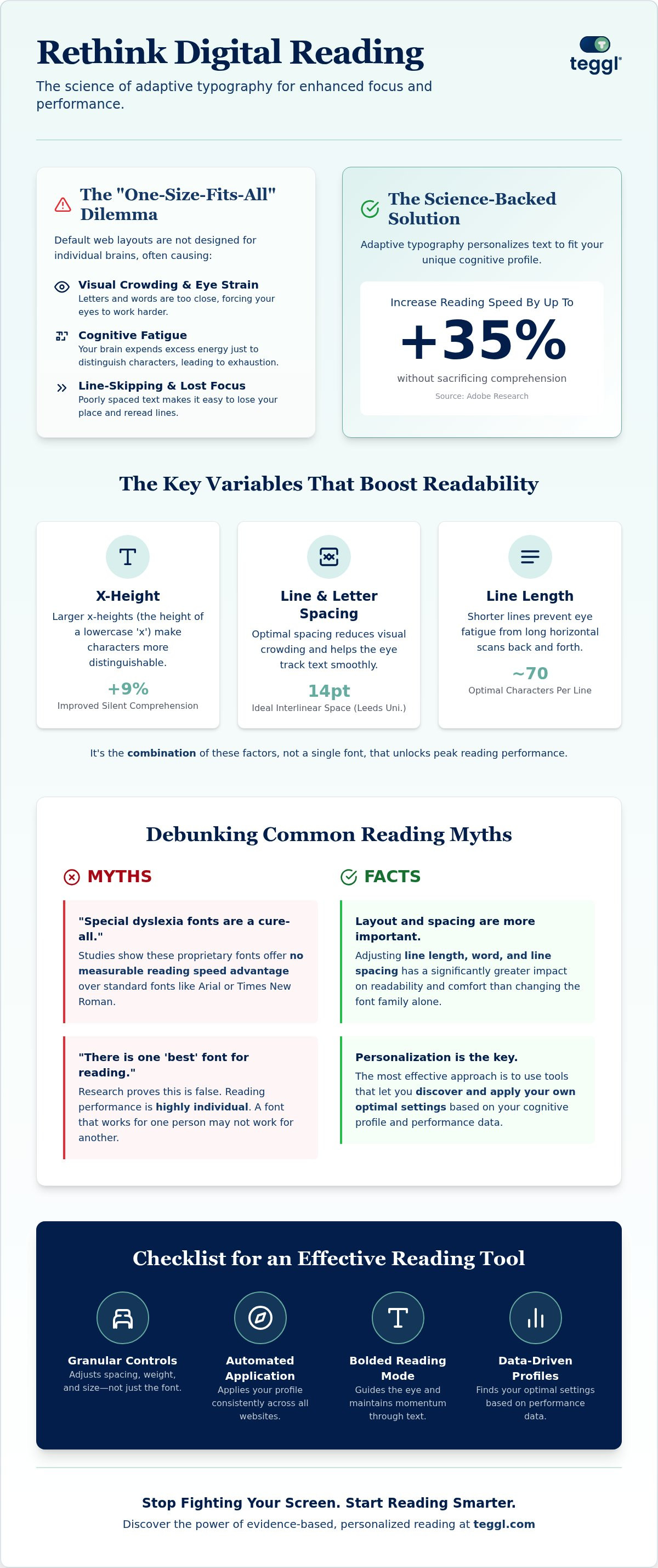
A personalized reading settings extension isn't just a basic font changer. It's a sophisticated tool that adapts web typography, including size, spacing, and character weight, to your specific cognitive needs. For years, designers chased a single "best" font for everyone. However, research proves this is a myth. The Science of Digital Readability shows that reading performance is highly individual. Adobe research from August 2026 highlights that personalizing these settings can boost reading speed by up to 35% without hurting comprehension.
Standard web layouts often trigger visual crowding, where letters and words appear too close together. This creates massive cognitive fatigue, especially for readers with ADHD or dyslexia. When text is cramped, the brain works overtime just to distinguish characters, which leads to line-skipping and mental exhaustion. A personalized reading settings extension solves this by creating the necessary breathing room for your eyes to track text effortlessly.
Evidence-Based Readability: Data from Adobe and Essex
Data drives better design. University of Essex findings show that larger x-heights, specifically around 5.0 mm, improve silent comprehension by approximately 9% compared to smaller 4.2 mm settings. For young readers, this simple adjustment can advance reading age by four months. While many assume specialized fonts are superior, research shows Verdana often outperforms fonts like Sassoon Primary in visual search tasks due to its clear, open structure. To further reduce visual stress and anchor your focus, you might try a Bolded Reading Modus to maintain momentum through dense digital paragraphs.
How to Evaluate a Personalized Reading Settings Extension: A 2026 Buying Guide
Choosing the right tool requires a focus on evidence rather than marketing claims. When evaluating accessibility in reading extensions, prioritize a personalized reading settings extension that adjusts line length, inter-line spacing, and character weight. Many people believe proprietary "dyslexia fonts" are a silver bullet. However, studies by Christian Boer and Alejandro Gonzalez show these fonts offer no measurable speed advantage over classic options like Arial or Times New Roman. Don't settle for a tool that just changes the font family.
True efficiency comes from layout optimization. University of Leeds research indicates that maintaining a 70-character line length and 14pt interlinear space significantly boosts reading speed and focus. This proves that how text sits on the page matters more than the specific letterforms used. Look for a personalized reading settings extension that automates these layout adjustments across every site you visit to ensure a consistent experience.
Critical Features for Cognitive Performance
Your extension should offer more than static changes. Features like Bolded Reading are essential for guiding the eye and maintaining momentum across digital screens. A high-quality reading comprehension tool must include granular spacing controls to reduce the time spent on "search-reading" tasks. While a basic "Reader View" simply strips away clutter, an adaptive typography extension actively modifies the text to fit your cognitive profile in real time. It's a dynamic approach to wellness and productivity. You can discover your optimal settings to see how these adaptive features transform your daily workflow.
Finding Your Optimal Profile: The Teggl Approach to Personalized Reading
Most users try to fix their digital experience by manually toggling browser settings. This trial and error approach is often inefficient and exhausting. Using the Teggl Reading Profile Test moves you from guesswork to data-driven precision. By measuring your actual performance across different typographical layouts, this personalized reading settings extension identifies exactly which variables unlock your peak focus. It's about working with your brain rather than against it.
Once your profile is established, Teggl automates the heavy lifting. It applies Leeds-recommended layouts and Adobe-validated font weights across every website you visit. This creates a consistent visual rhythm that aligns with the latest research in personalized reading. It removes friction before it starts. For those battling online reading distractions, the Bolded Reading Mode provides a high-contrast anchor that keeps your eyes moving forward without the need for constant re-reading.
Implementing Your Personal Reading Strategy
Ready to optimize? You can refine your digital environment in three simple steps. First, take the performance test to establish your baseline. Second, use the personalized reading settings extension to identify your optimal character width and spacing. Finally, save your profile to ensure every article you read is automatically formatted for your comfort.
Take the Reading Profile Test to establish your performance baseline.
Adjust character width and spacing based on your specific visual needs.
Enable Bolded Reading Mode to mitigate sensory overload during long research sessions.
Teggl serves as a comprehensive accessibility solution that balances high-speed productivity with the sensory comfort your eyes deserve. Stop settling for a tiring web experience. Experience the immediate relief of a personalized digital environment and discover your optimal settings today.
Master Your Digital Information Flow
Digital readability isn't a static choice; it's a dynamic alignment between technology and your brain's unique processing patterns. We've seen how evidence-based adjustments to x-height and line spacing can transform your efficiency. By integrating a personalized reading settings extension into your daily workflow, you move beyond the limitations of default web design. You transition from struggling with visual crowding to experiencing the clarity of adaptive typography.
It's time to reclaim your focus and reduce cognitive load. Whether you're navigating complex research or scanning daily news, your environment should support your well-being. Don't guess what works for you. Discover your optimal reading settings with the Teggl Reading Profile Test and see the difference that data-driven personalization makes. You deserve a seamless reading experience that feels as natural as it is productive. Start your journey toward visual relief today.
Frequently Asked Questions
Can a personalized reading settings extension really improve my reading speed?
Yes, research confirms that personalizing your typography can lead to a 35% increase in reading speed. This happens without compromising comprehension. A personalized reading settings extension helps you find the exact combination of font size and spacing that matches your cognitive profile. Since there's no universal font, these tools empower you to create a high-performance environment tailored to your specific brain.
Does the Dyslexie font work better than standard fonts for reading speed?
Scientific studies found no statistically significant advantage for Dyslexie over standard fonts like Arial. In large-scale experiments, only about 10% to 13% of participants favored the specialized typeface. Most actually preferred conventional options. This highlights why a personalized reading settings extension is more effective than a single font. It focuses on adaptive layout features that actually reduce visual stress for the reader.
What typographic layout features are most important for academic reading?
Research from the University of Leeds suggests that a 70-character line length is critical for efficiency. Inter-line spacing of 14pt also helps significantly. Academic materials benefit most from legible layouts that include serif body text and wide margins. These features help you navigate dense information faster. They improve your answer-per-second efficiency, even when you aren't under time pressure to finish your work.
Is there a cost to using personalized reading extensions like Teggl?
Teggl offers different tiers to suit individual needs. This includes a 14-day free trial to explore its adaptive typography features. There are monthly and annual subscription options available for users who want full access to the Reading Profile Test and Bolded Reading Mode. You can check the official website for current plan details to discover which configuration best supports your long-term digital productivity.
Comments