
Online Reading Focus Enhancer: The 2026 Science-Backed Guide to Digital Readability
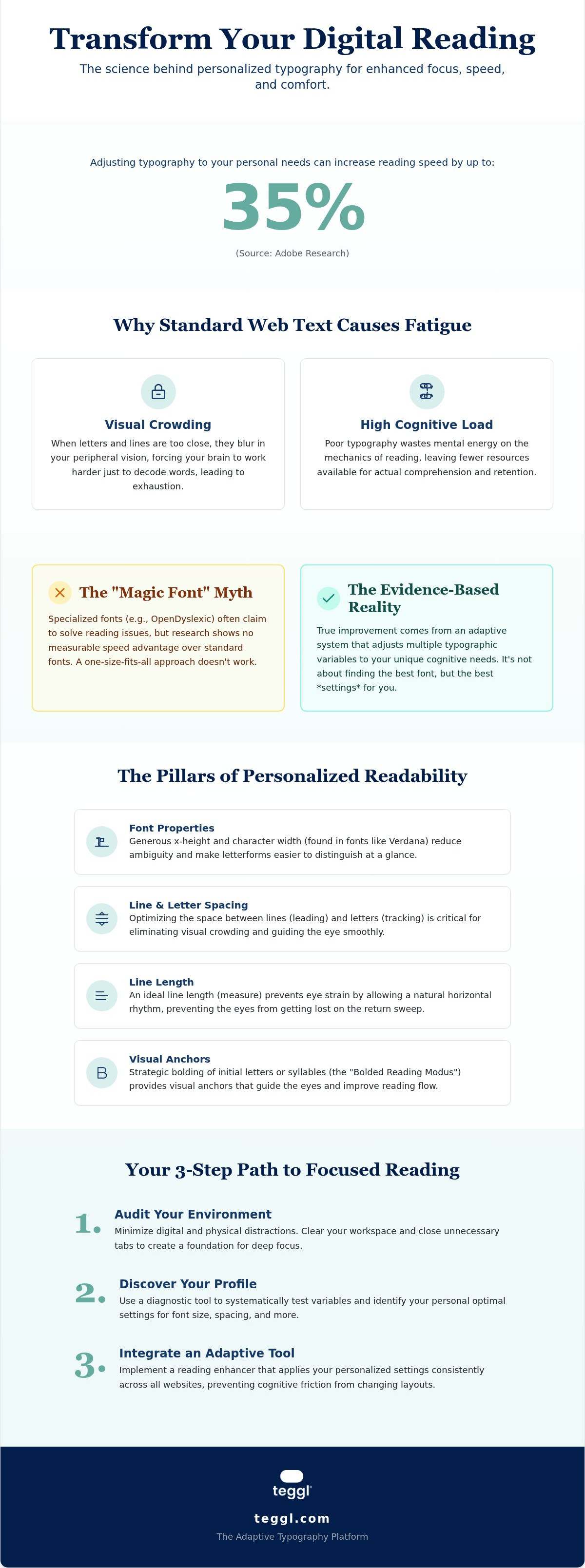
Did you know that simply adjusting your typography can increase your digital reading speed by up to 35%? Adobe research confirms that focus isn't a lack of discipline; it's often a mismatch between static web text and your individual cognitive processing. You've likely struggled with visual crowding that causes line-skipping or felt the heavy mental fatigue that follows a long day of screen time. It's exhausting to fight against poor web layouts. An online reading focus enhancer can finally give your eyes the relief they need.
This guide shows you how to transform your experience by reducing cognitive load through adaptive tools. We'll explore the science of personalized readability and the impact of the April 2026 WCAG 2.1 accessibility standards to help you build a custom reading environment that boosts performance while protecting your well-being.
Table of Contents
What is an Online Reading Focus Enhancer and Why Do You Need One?
An online reading focus enhancer is a sophisticated tool designed to modify digital text so it matches human cognitive architecture. Rather than forcing your eyes to adapt to rigid, static layouts, these tools reconfigure typography to suit your brain's processing needs. This shift is essential because most web design prioritizes aesthetics over accessibility. When you use an online reading focus enhancer, you aren't just changing a font; you're implementing an adaptive typography strategy that reduces the friction between your eyes and the screen.
A primary barrier to digital focus is "visual crowding." This occurs when letters blur together in your peripheral vision, forcing your brain to work significantly harder just to decode individual words. This constant struggle drains your mental energy long before you finish an article. By optimizing variables like line length and spacing, you can eliminate this visual noise and maintain clarity during long reading sessions.
The Science of Visual Fatigue and Digital Distraction
Research from the University of Leeds highlights how specific layout variables, such as inter-line spacing and line length, directly impact search-reading efficiency. Understanding how people read on screens is vital because our eyes often skip across text in an F-pattern. While search reading helps us find keywords, deep reading requires a more stable environment to ensure comprehension doesn't drop as speed increases.
Cognitive load is the total amount of mental effort required by your working memory to process and store new information while reading. When typography is poor, your brain wastes resources on decoding instead of understanding. Adaptive tools solve this by creating a personalized environment that protects your focus and prevents the exhaustion typical of modern digital life.
Comparing Reading Enhancers: Personalized Research vs. Generic Fonts
For years, the digital world relied on "magic fonts" like OpenDyslexic to solve focus issues. However, studies by researchers like Christian Boer and Alejandro Gonzalez found no measurable speed advantage for these specialized typefaces compared to standard sans-serifs. These specialized designs often prioritize weight at the bottom of characters, but research shows this doesn't actually help the brain process letters faster than standard Arial or Verdana. This data is supported by a meta-analysis on digital reading distractions which suggests that focus is less about a specific font and more about how we manage our digital environment.
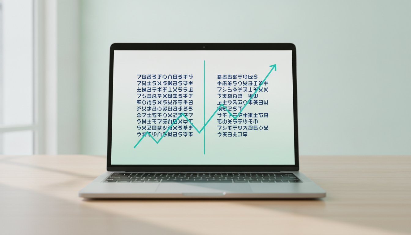
The real breakthrough comes from Adobe Research, which demonstrates that readers achieve up to 35% faster speeds when using their personally optimal font. An effective online reading focus enhancer doesn't just swap one font for another; it adapts to the user's specific visual needs. This is why the bolded reading modus has emerged as a superior alternative, providing visual anchors that guide the eye without the clunkiness of static font changes.
Evidence-Based Typography: Why Verdana and Montserrat Outperform the Rest
When selecting an online reading focus enhancer, the focus should be on evidence, not aesthetics. Data from the University of Essex shows that Verdana can outperform Sassoon Primary by 5-9% in search performance. This isn't because Verdana is "better" in a vacuum, but because its generous x-height and character width reduce visual crowding. While some research shows conflicting results regarding which specific font is "best," the consensus remains clear: personalization is the only way to ensure maximum focus. You can discover your unique reading profile to see which variables actually move the needle for your comprehension and speed.
Implementing a Personalized Reading Strategy for Maximum Focus
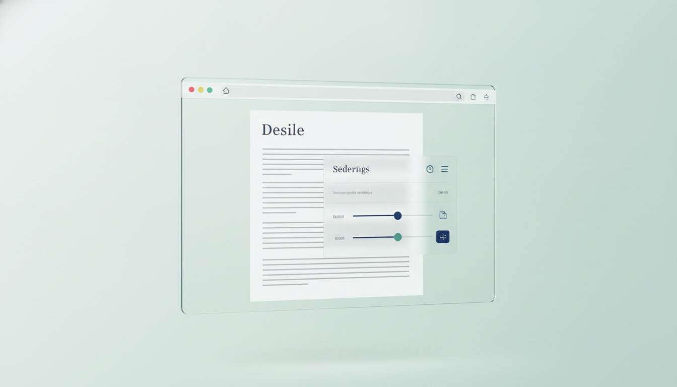
Achieving peak digital performance requires a systematic approach that begins with your physical and digital surroundings. First, audit your current environment. Learning afleidingen verminderen tijdens online lezen starts with layout optimization to remove visual noise. Once your workspace is clear, use a diagnostic tool like Teggl’s Reading Profile Test. This assessment identifies your optimal x-height, line spacing, and bolding levels, ensuring your online reading focus enhancer is tuned to your specific cognitive needs.
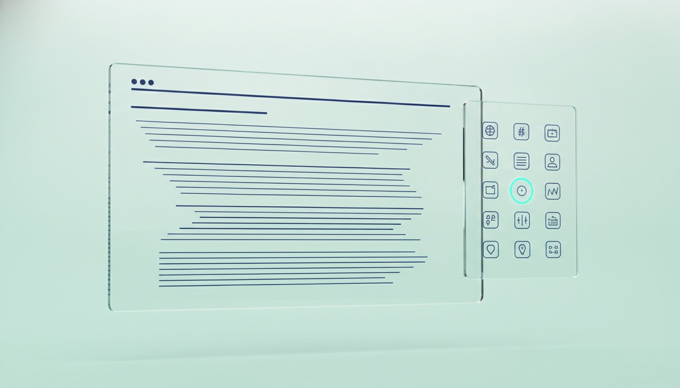
Next, integrate a tekstbegrip verbeteren tool that adapts to different website architectures. This consistency prevents the brain from having to re-adjust to new layouts on every page. Finally, calibrate your screen quality. Research comparing fonts like Montserrat and Garamond shows that adjusting contrast and brightness can significantly reduce visual stress. This is vital for older readers who often face increased fatigue from low-contrast digital text.
Beyond the Browser: Creating a Seamless Reading Experience
Your online reading focus enhancer works best when paired with healthy habits. Combine Teggl's Bolded Reading Mode with indirect lighting and proper physical posture to prevent sensory overload. Use this checklist to switch profiles based on your current task:
Search-Reading: Use wider character spacing to scan for keywords quickly.
Deep-Reading: Enable bolded anchors to maintain focus on long-form articles.
Don't settle for a static experience. You can use the Teggl extension and compare your performance to see how personalized typography transforms your daily workflow and increases your speed without sacrificing comprehension.
Master Your Digital Reading Environment
Shifting from static web design to adaptive typography is the most effective way to reduce cognitive friction and eliminate visual crowding. You've learned that prioritizing evidence-based variables like x-height and bolded anchors over generic font swaps aligns digital text with your brain's unique processing needs. Integrating an online reading focus enhancer into your daily workflow isn't just about speed. It's about protecting your mental energy and achieving clarity in an information-heavy world. Small adjustments to your environment and layout can lead to significant gains in both comprehension and physical comfort.
Ready to transform your digital experience? Discover your optimal reading settings with the Teggl Reading Profile Test. Based on Adobe Research findings and university-backed typographic principles, this test creates a profile personalized to your unique cognitive architecture. Start optimizing your workspace today and reclaim your focus with confidence.
Frequently Asked Questions
Can a personalized font really improve my reading speed by 35%?
Adobe Research confirms that individuals can read up to 35% faster with their personally optimal font without losing comprehension. This improvement occurs because the right typography reduces the mental energy spent on decoding individual letters. Since no single typeface works for everyone, using a diagnostic tool to find your specific match is essential for maximizing your digital reading performance and focus.
Do 'dyslexia fonts' like OpenDyslexic actually work for focus?
Independent studies, including those published in the Annals of Dyslexia, found no measurable benefit for specialized fonts like OpenDyslexic compared to standard options like Arial or Verdana. Most readers actually perform better with familiar, well-designed sans-serif fonts. True readability comes from personalizing layout variables like line length and spacing rather than relying on a single typeface designed for a specific condition.
What is Bolded Reading and how does it help with concentration?
Bolded Reading is a text-optimization mode that uses bolded characters to create strong visual anchors for the eye. This method helps your brain navigate digital text more quickly by reducing visual crowding and preventing line-skipping. It's a core feature of an effective online reading focus enhancer, designed to maintain high concentration levels during deep-reading tasks without the need for specialized fonts.
Is there a universally 'best' font for reading online?
Scientific evidence shows that there is no universally perfect font for every reader. While the University of Essex found that Verdana outperforms many other typefaces for search tasks, individual needs vary based on age and vision. The most effective strategy is to use adaptive technology that adjusts font size, weight, and contrast to match your unique cognitive profile and environmental factors.
Comments