
Dyslexia Reading Tools: Personalized Typography Guide
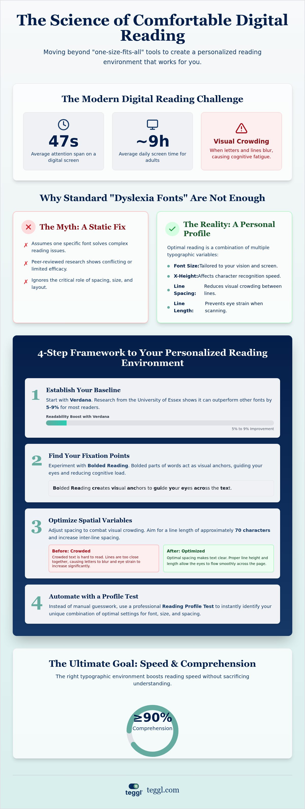
The average human attention span on a digital screen has dropped to just 47 seconds, yet most of us spend up to nine hours a day navigating rigid text environments. If you are searching for effective dyslexie hulpmiddelen online lezen, you already know that standard web fonts often lead to visual crowding and intense cognitive fatigue. It's frustrating when letters seem to dance or blur together, making even a simple article feel like a marathon. You deserve a digital environment that adapts to your eyes, not the other way around.
This guide promises to show you how to optimize your digital reading performance by moving beyond generic tools to a research-backed, personalized typographic environment. We will explore how specific adjustments to spacing, x-height, and bolded reading can reduce visual stress and increase reading speed without losing comprehension. You'll discover how an adaptive typography platform can transform any website into a seamless, comfortable space tailored to your unique cognitive profile.
Table of Contents
Why Standard Dyslexia Tools Often Fall Short for Online Reading
Most digital accessibility tools rely on the assumption that a single font or a high-contrast mode can resolve complex reading difficulties. This "one-size-fits-all" approach is a myth. When you search for dyslexie hulpmiddelen online lezen, you'll likely encounter specialized fonts like OpenDyslexic or Dyslexie Font. While these are well-intentioned, peer-reviewed research often shows conflicting results regarding their efficacy. Reading performance isn't tied to a single typeface; it's the result of multiple variables like font size, x-height, and line spacing working in harmony.
Visual crowding is a primary hurdle for many readers. This phenomenon occurs when the proximity of letters and lines creates a "noise" effect, causing characters to blur or appear to move. A foundational understanding of dyslexia highlights that it's often about how the brain manages visual signals during saccades, the rapid jumps our eyes make across a line of text. Static tools fail because they don't account for these individual eye-movement patterns.
The Science of Visual Crowding and Character Recognition
The height of lowercase letters, or x-height, plays a critical role in how quickly we recognize characters. Adobe Research has demonstrated that different cognitive profiles require different typographic structures to reach peak performance. For example, their findings suggest that while some readers find success with Montserrat, others experience better comprehension with Garamond. Your brain's ability to process text is unique, meaning the best dyslexie hulpmiddelen online lezen are those that offer a personalized typographic environment rather than a static fix.
Why Personalization Beats Static Accessibility
Static accessibility settings are often too rigid for the modern web. They might change the text too much, breaking the website's layout, or too little, leaving you with the same eye strain. Achieving quiet reading on busy websites requires an adaptive approach. Instead of forcing your eyes to adjust to a standard font, you should have the power to modify the environment to your specific needs. Personalization removes the friction from digital reading, allowing you to focus on the content rather than the struggle of decoding it.
How to Build Your Personalized Reading Environment: A 4-Step Framework
Finding the right dyslexie hulpmiddelen online lezen often feels like a trial-and-error process. To remove the guesswork, you need a structured approach that prioritizes your specific visual needs. Follow this four-step framework to transform your digital experience from exhausting to effortless.
Step 1: Establish your baseline. Start by reading a standard text in Verdana. Research from the University of Essex indicates that Verdana outperforms other fonts by 5-9% for both early and adult readers. This gives you a reliable starting point.
Step 2: Test fixation points. Experiment with variable bolding weights. These serve as anchors for your eyes, helping you maintain focus as you move through sentences.
Step 3: Optimize spatial variables. Adjust your line length to approximately 70 characters. Increasing inter-line spacing can also help mitigate the visual crowding effects discussed earlier.
Step 4: Automate with a Reading Profile Test. Instead of manually tweaking every setting, use a professional assessment to find your "sweet spot" instantly.
Measuring Speed vs. Comprehension
Increasing your reading speed is a major goal, but it shouldn't come at the cost of understanding. Aim for a comprehension threshold of at least 90%. University of Leeds research highlights that typographic layout significantly affects efficiency even when you aren't under time pressure. If you find yourself re-reading lines, your settings aren't yet optimal. You can discover your optimal reading settings by testing different layouts in a controlled environment.
Choosing the Right Font Foundations
While many people seek out specialized fonts, evidence suggests that a well-designed sans-serif like Verdana often provides superior readability on digital screens. The key isn't just the font itself, but how it integrates with other features. Integrating these foundations into a bolded reading modus allows for a truly adaptive experience. This method combines familiar letterforms with modern fixation technology to maximize your cognitive performance without the frustration of static tools.
Implementing Teggl: The Adaptive Solution for Dyslexic Readers
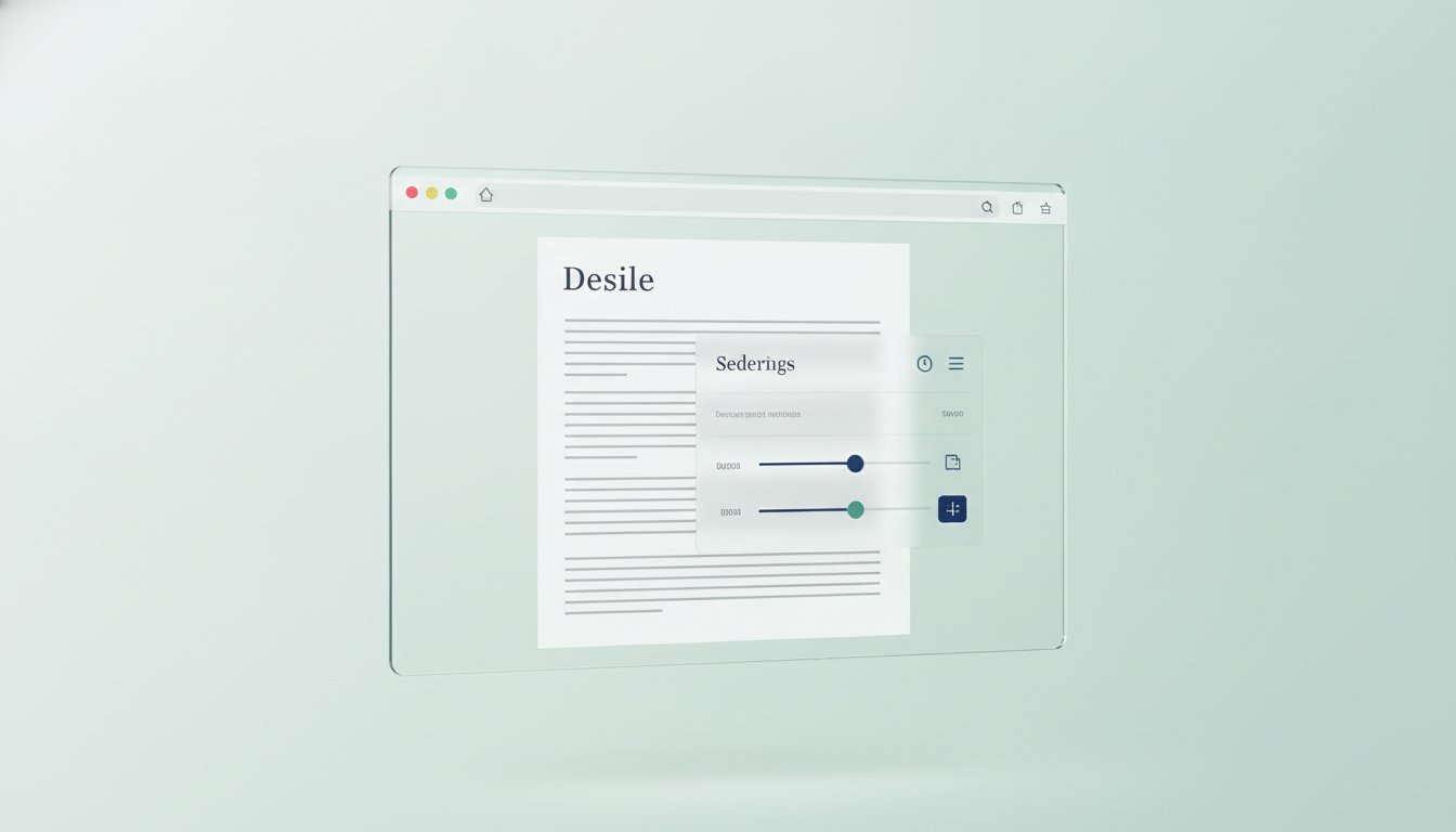
Many legacy dyslexie hulpmiddelen online lezen require you to copy and paste text into a separate application. This disrupts your workflow and breaks the visual context of the web. The Teggl Browser Extension solves this by applying adaptive typography directly to the source. It functions as a sophisticated layer over any website, meaning you don't have to leave your tab to experience a better reading environment. Since all processing happens locally in your browser, your data remains private and the performance is nearly instantaneous.
Digital fatigue often stems from inconsistent layouts and harsh contrasts. Teggl stabilizes these elements, creating a sensory-friendly environment that reduces the mental energy required to decode text. By anchoring your focus through the Bolded Reading Mode, the extension helps prevent the visual "drifting" common during long-form reading. This stabilization is key to maintaining a high comprehension threshold while navigating text-heavy digital spaces.
Customization Beyond the Bold
Personalization is about more than just one setting. Within the Teggl interface, you can adjust character weight and spacing in real-time to match your current cognitive state. You might prefer a more aggressive bolding for complex research papers and a lighter touch for casual news articles. Creating site-specific profiles ensures that your favorite websites always load with your optimal typographic settings, removing the need for constant manual adjustments.
Getting Started with Personalization
Your journey begins with the Teggl Reading Profile Test. This essential first step removes the guesswork by identifying exactly which variables, like x-height or line length, impact your speed the most. Once you've established your profile, installing the extension takes seconds. Conduct your first reading performance audit to see the immediate difference in your comfort levels. You'll find that toggling settings to reach a "flow state" becomes intuitive, turning the digital world into a place where you can read comfortably for hours.
Take Control of Your Digital Reading Experience
Digital reading shouldn't feel like a constant battle against the screen. We've explored why static fonts often fail and how a personalized framework can help you reclaim your focus. By understanding that your visual profile is unique, you can move away from generic tools and toward a system that truly works for your eyes. Finding the right dyslexie hulpmiddelen online lezen is no longer about trial and error; it's about using evidence-based technology to create a frictionless environment where text feels stable and clear.
Teggl offers a sophisticated way to optimize every website you visit without the need for cumbersome text uploads or invasive software. Our platform is built on peer-reviewed readability research, ensuring that every adjustment to character weight or line spacing serves your cognitive performance. It's time to stop settling for standard settings and start reading with clarity. You can discover your optimal reading profile with the Teggl Browser Extension to see the difference for yourself. Take the first step toward a more comfortable, productive digital life today. You deserve a reading experience that adapts to you.
Frequently Asked Questions
What is the most effective dyslexia tool for online reading in 2026?
The most effective tool is a personalized, adaptive typography platform that adjusts to your unique visual profile. In 2026, the landscape has shifted away from specialized file formats toward universal accessibility. Tools like the Teggl browser extension allow you to optimize any website in real-time, making it the most versatile choice for modern digital environments.
Do dyslexia fonts actually work for everyone?
No, research shows that specialized fonts are not a universal solution for every reader. Reading performance is influenced by a complex mix of variables like x-height, character spacing, and line length. While some find relief with specific typefaces, others see better results by searching for dyslexie hulpmiddelen online lezen that offer deep personalization rather than a single font change.
How can I increase my reading speed without losing comprehension?
You can increase your speed by optimizing your typographic layout to reduce visual noise and crowding. University of Leeds research confirms that layout affects reading efficiency even without time pressure. Implementing fixation points through Bolded Reading helps anchor your focus, allowing your eyes to move more fluidly across the page without sacrificing your understanding of the material.
Is there a free alternative to expensive dyslexia software for Chrome?
Yes, the Teggl extension offers a highly effective alternative that you can start using for free on Chrome, Edge, and Firefox. Unlike expensive, standalone software that often requires you to move text into a proprietary app, Teggl works directly on the websites you're already visiting. This provides a seamless and cost-effective way to improve your digital reading experience.
Can a personalized font really increase reading speed by 35%?
Yes, studies by Adobe Research have shown that finding the right personalized font can boost reading speed by 35%. This significant improvement happens because the brain processes certain letterforms more efficiently than others depending on the individual. It's not about finding a "dyslexia font" but about discovering the specific typographic settings that match your cognitive profile.
Is my data safe when using a reading browser extension?
Your data is safest when using extensions that rely on local browser processing rather than cloud-based conversion. Teggl prioritizes your privacy by modifying typography directly within your browser. This means your text and reading data are never uploaded to an external server, ensuring a faster and more secure experience while you navigate the web.
Comments