
Digital Text Comprehension Aid: The 2026 Science-Backed Guide to Reading Optimization
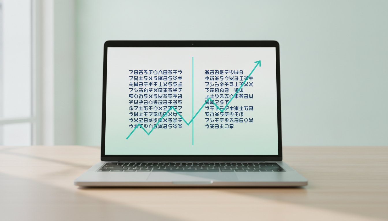
Did you know that switching to a personalized font can increase your reading speed by up to 35%? It's a startling figure from Adobe Research that challenges the traditional one-size-fits-all approach to web design. Most of us struggle with digital mind-wandering or the physical fatigue of staring at dense, crowded screens. You've likely felt that familiar strain where your eyes skip lines or lose their place entirely. Finding the right digital text comprehension aid isn't just about convenience. It's about reclaiming your focus in a world designed to distract you.
We understand the mental weight of navigating a text-heavy digital environment. This guide explores how personalized reading technology and adaptive typography can transform your screen into a sanctuary of clarity. We'll break down the latest 2026 science behind visual ergonomics and show you how to build a reading environment that reduces effort while maximizing understanding.
Table of Contents
The Cognitive Mechanics of Digital Text Comprehension
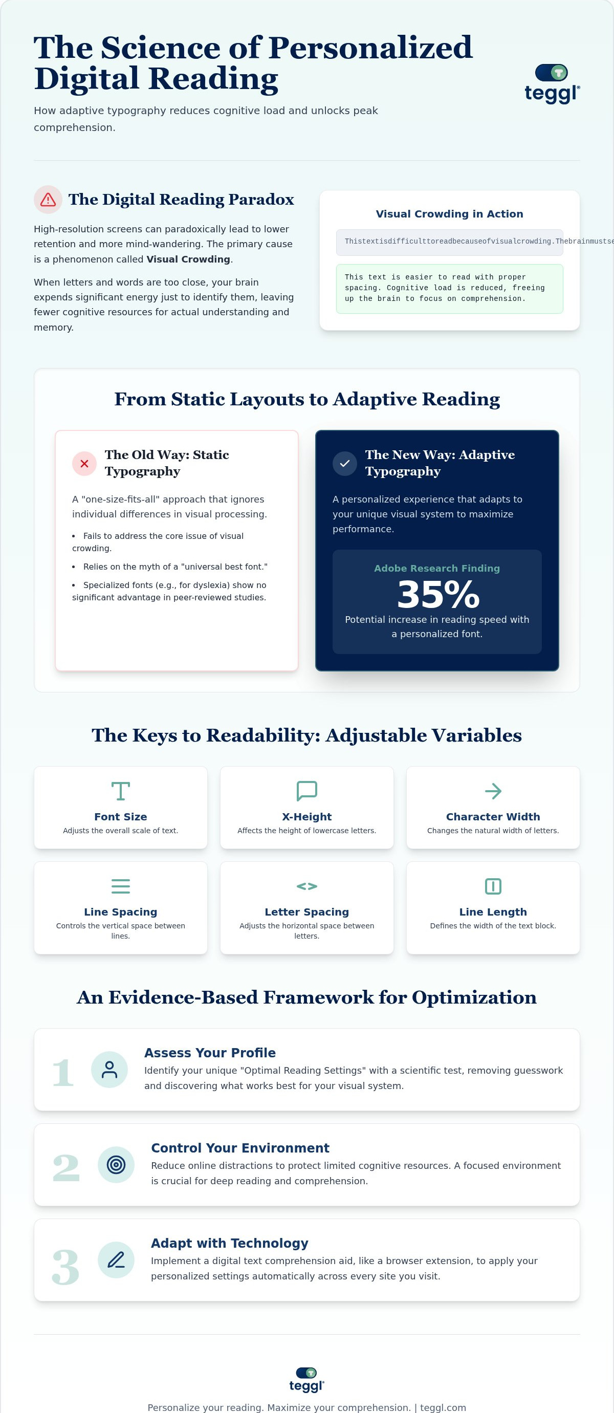
A digital text comprehension aid is more than just a font; it's an adaptive technology designed to modify visual variables like spacing and contrast to reduce cognitive load. Understanding The Cognitive Mechanics of Digital Text Comprehension helps explain the "Digital Reading Paradox." While modern screens offer incredible clarity, readers often report lower retention and higher rates of mind-wandering compared to print. This isn't a lack of discipline. It's a physiological response to how our brains process light-emitting pixels.
The primary hurdle is visual crowding. This phenomenon occurs when adjacent letters interfere with one another, exhausting the brain's processing power just to identify individual characters. When your brain is busy decoding crowded symbols, it has less energy left for deep synthesis and memory formation. This mental drain makes long-form digital reading feel like a chore rather than an opportunity for growth.
Visual Crowding and the Ergonomics of Online Reading
Most standard web fonts prioritize aesthetic appeal over the specific "search-reading" demands of a professional environment. Research from the University of Leeds shows that layout variables, such as line length and letter spacing, significantly impact how efficiently we find and process information. Even without time pressure, poor typography forces the eyes to work harder, leading to rapid fatigue. Visual crowding is the primary bottleneck in digital comprehension, acting as a cognitive tax on every sentence read. To overcome this, we must shift our focus from how a page looks to how it functions for the human eye.
Comparing Solutions: Personalization vs. Static Typography
Traditional accessibility tools like Text-to-Speech (TTS) offer relief by bypassing the eyes, but they don't solve the core issue of visual processing. For those who need to scan and synthesize information rapidly, a visual digital text comprehension aid is often more effective. This is where we see the shift from static layouts to adaptive typography. When Comparing Solutions: Personalization vs. Static Typography, the data is clear. Research from the Readability Consortium proves that no single font is optimal for everyone. Instead, Adobe Research found that readers can achieve a 35% increase in speed simply by using their personalized optimal font. This suggests that the "best" font is actually a moving target that depends on the individual.
The Mixed Evidence for Dyslexia-Specific Fonts
Many readers assume that specialized fonts like OpenDyslexic or Dyslexie are the gold standard for cognitive support. However, peer-reviewed studies show no statistically significant advantage in speed or accuracy over standard sans-serif fonts like Arial. In contrast, a University of Essex study found that Verdana provided a 5-9% performance lead for early readers over specialized primary fonts. The secret to improving text comprehension through a digital text comprehension aid isn't a unique letter shape. It's the precise adjustment of x-height, character width, and letter spacing. Every reader's brain responds differently to these variables based on their unique visual system. You can discover your own ideal settings by taking a Reading Profile Test to see which specific adjustments unlock your peak performance.
An Evidence-Based Framework for Reading Optimization
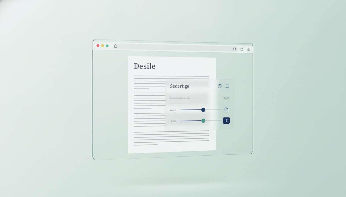
Transitioning from theory to peak performance requires a systematic approach. You can build a superior reading experience by following a three-step process: Assessment, Environmental Control, and Adaptive Technology. Start with a Reading Profile Test to identify your unique "Optimal Reading Settings." This scientific method analyzes how your visual system reacts to specific x-heights and character widths, removing the guesswork from your digital setup. Once you've identified your profile, focus on reducing online distractions to protect your limited cognitive resources. Finally, implement a digital text comprehension aid like the Teggl browser extension to apply these settings automatically across every site you visit.
Implementing Adaptive Typography in Your Daily Workflow
Small adjustments lead to massive gains in efficiency. For professional reading, configure your display for 70-character line lengths and 14pt interlinear spacing. These specific dimensions align with visual ergonomics to minimize the physical effort of tracking across a screen. Always stick to left-aligned columns, as they provide a reliable and consistent "home base" for your eyes after every line break. Use Bolded Reading Mode as a cognitive anchor to maintain momentum during dense research. This feature emphasizes key character clusters, guiding your gaze and preventing the frequent line-skipping that occurs as mental fatigue sets in. Don't let static, outdated web designs dictate your productivity. By adopting a personalized technology that evolves with your environmental factors, you turn every long reading session into a seamless, focus-driven experience.
Master Your Digital Reading Environment
The shift toward personalized typography marks a new era in cognitive performance. By addressing visual crowding and optimizing layout variables based on University of Leeds research, you can transform how you absorb information. A specialized digital text comprehension aid isn't just a luxury; it's a tool for navigating an increasingly dense information landscape. Adobe Research demonstrates that finding your ideal settings can boost reading speed by up to 35%. This isn't about finding a single "best" font, but about adapting your screen to your brain's unique visual system. Evidence-based features like Bolded Reading provide the cognitive anchor needed to maintain focus during long sessions. It's time to stop fighting against static web designs and start reading with clarity. Discover your optimal reading settings with the Teggl Reading Profile Test and experience a seamless, high-performance digital environment today.
Frequently Asked Questions
Can a digital text comprehension aid really improve my reading speed?
Yes, a personalized digital text comprehension aid can significantly boost performance. Adobe Research indicates that readers can increase their speed by up to 35% when using their personally optimal font while maintaining high comprehension levels. This improvement occurs because the text is tailored to your specific visual processing needs, allowing your brain to decode characters faster and with much less effort.
What is the difference between Bionic Reading and Bolded Reading?
The primary difference lies in personalization and research-backed implementation. Bolded Reading Mode is a specific feature of the Teggl Browser Extension that acts as a cognitive anchor to prevent line-skipping. While other methods use static bolding, Teggl integrates these visual cues into a broader adaptive typography platform. This ensures that the adjustments are balanced against your specific environmental factors and cognitive needs.
Is there a single best font for readers with dyslexia or ADHD?
No single font works for everyone. Research from the Readability Consortium and a 2017 study in the Annals of Dyslexia show that specialized fonts like OpenDyslexic don't provide a measurable speed advantage over standard fonts like Arial. Performance is actually driven by individual factors like x-height and letter spacing. It's more effective to use a Reading Profile Test to find your personal settings.
How does adaptive typography reduce digital mind-wandering?
Adaptive typography minimizes the "Digital Reading Paradox" by optimizing visual ergonomics. By adjusting variables like line length and interlinear space, a digital text comprehension aid removes the physical obstacles that cause eye strain. When your brain stops struggling with visual crowding, it has more cognitive energy available for retention. This naturally prevents your mind from wandering during long reading sessions.
Comments