
Beyond Diagnosis: The 2026 Guide to Reading Profile Assessment Online
Did you know that the "standard" font on your screen might be slowing you down by as much as 35%? Most of us accept digital eye strain and line skipping as the inevitable cost of living in a text-heavy world. However, research from Adobe proves that personalized typography can radically transform your cognitive performance. By completing a reading profile assessment online, you can move beyond generic scores and identify the exact typographical variables tailored to your unique visual needs.
It's exhausting to feel mentally drained after just a few articles, especially when most tools offer a diagnosis without a remedy. You deserve a digital environment that adapts to you. In this guide, you'll learn how to optimize settings to eliminate visual crowding and increase speed without losing comprehension. We'll explore the 2026 shift toward personalized accessibility and show you how to automate these settings for a seamless, high-performance reading experience.
Table of Contents
The Evolution of Reading Profile Assessments: From Classroom Diagnosis to Digital Optimization
A reading profile assessment is a personalized analysis of how visual and cognitive variables affect your unique information processing. For decades, these tools lived in classrooms to identify skill gaps. Today, we've entered the era of cognitive ergonomics. We're no longer just asking "how well do you read?" but "how can your screen read you?" Standard tests often fail because they ignore visual crowding and screen-based fatigue. This shift marks a significant milestone in the evolution of reading assessments, moving away from static pedagogical scores toward environmental optimization.
Using a reading profile assessment online allows you to move beyond generic browser settings. It identifies how specific typographical adjustments can reduce the mental load of processing text. By analyzing your response to different layouts, these tools create a roadmap for digital comfort and speed. You stop guessing which settings work and start using data to drive your productivity.
Why a 'One-Size-Fits-All' Font Approach Fails the Modern Reader
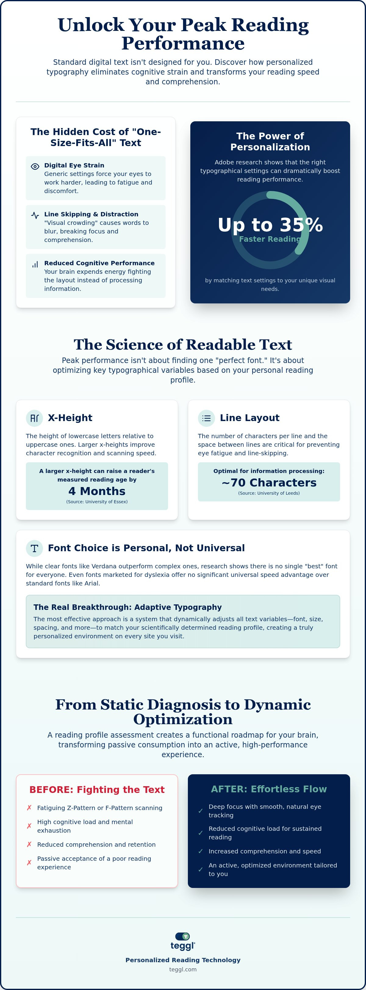
Your brain doesn't process text like everyone else's. Adobe research highlights that optimal fonts are highly individual. In fact, some readers perform 35% faster when using their personal best typeface. Standard "safe" fonts often trigger "visual crowding," which causes lines to skip and words to blur. This is a common struggle for readers with ADHD or dyslexia. A modern reading profile assessment online must evaluate your digital environment. It needs to look at contrast, spacing, and screen quality to find your peak performance zone. When you stop fighting the layout, your comprehension naturally climbs.
Key Metrics in a Modern Online Reading Assessment: Typography and Cognitive Ergonomics
A comprehensive reading profile assessment online identifies the specific typographical levers that reduce cognitive load. Research from the University of Essex found that larger x-heights can raise a reader's measured reading age by 4 months. This metric measures the height of lowercase letters relative to uppercase ones, directly impacting how easily your eyes distinguish characters during rapid scanning. While tools like Stanford's Rapid Online Assessment of Reading (ROAR) evaluate foundational skills, a modern assessment focuses on these physical variables to maximize digital performance.
Layout is equally critical for sustained focus. The University of Leeds suggests that a 70-character line length paired with a 14pt interlinear space creates the most efficient environment for information processing. These specific variables prevent the "visual crowding" that leads to line-skipping and eye fatigue. A modern reading profile assessment online now includes "Bolded Reading" metrics to see if visual anchors help you maintain momentum through dense paragraphs. You can discover your own optimal settings by taking a reading profile test today.
The Science of Font Selection: Beyond Serif vs. Sans-Serif
Specific fonts like Verdana and Montserrat often outperform others because of their generous spacing and clear letterforms. Interestingly, peer-reviewed research shows that "dyslexia-friendly" fonts like Dyslexie or OpenDyslexic offer no significant speed advantage over standard fonts like Arial. The real breakthrough isn't finding a single "best" font for everyone. It's adaptive typography. This approach uses your assessment data to dynamically adjust every variable on the screen, creating a personalized environment that evolves with your needs.
Implementing Your Results: How Personalized Reading Technology Transforms Digital Performance
Unlike the broad benchmarks used in the National Assessment of Educational Progress (NAEP) in reading, Teggl’s Reading Profile Test focuses on the specific ergonomics of your screen. It identifies your "reading sweet spot" by measuring how font size, contrast, and spacing impact your real-time processing speed. This isn't about a static score; it's about creating a functional roadmap for your brain. By finishing a reading profile assessment online, you move from passive consumption to active optimization.
Digital readers often fall into the Z-pattern or F-pattern of scanning, which triggers cognitive fatigue and reduces comprehension. Personalized settings help you maintain deep focus by making the text easier to track. When your eyes don't have to work as hard to find the next line, your brain can dedicate more energy to understanding the content. You can implement these gains in three simple steps: first, identify your optimal x-height through the test; second, sync that data with your browser; and third, let the technology handle the adjustments automatically.
From Assessment to Action: Using Teggl to Optimize Your Web Experience
Teggl’s Bolded Reading mode applies your profile results across any website you visit, reducing cognitive load instantly. It creates visual anchors that guide your eyes, preventing the line-skipping that often occurs in high-distraction environments. For a detailed breakdown of these features, check out the Bolded Reading Modus: The 2026 Buyer’s Guide to Personalised Reading Tools. You should also learn how to reduce online reading distractions by combining your reading profile assessment online data with focus-enhancing browser behaviors for a truly frictionless experience.
Master Your Digital Environment
Digital reading doesn't have to be a source of mental fatigue. By moving beyond a simple diagnosis and embracing adaptive typography, you regain control over your focus. You've seen how specific variables like x-height and line length dictate your cognitive load. Now it's time to apply those insights. Completing a reading profile assessment online is the first step toward a frictionless digital life. Professionals use these evidence-based optimizations to combat digital fatigue and maintain peak performance. Teggl offers a non-invasive, browser-level solution that transforms every page you visit into a high-performance environment tailored just for you. Don't settle for a one-size-fits-all web. You have the power to optimize your experience and read with newfound clarity.
Take the Teggl Reading Profile Test and discover your optimal settings to unlock your full potential today. Your most efficient reading experience is just a few clicks away.
Frequently Asked Questions
What exactly does a reading profile assessment online measure?
A reading profile assessment online measures how your brain and eyes respond to specific typographical variables. It evaluates your performance across different font sizes, x-heights, and line lengths. It doesn't just test vocabulary; it identifies the environmental settings that reduce visual crowding. This data allows you to create a personalized digital reading space that maximizes your focus and information processing efficiency.
Can a personalized font really improve my reading speed by 35%?
Yes, evidence-based research from Adobe indicates that readers can increase their speed by up to 35% when using their personally optimal font. This improvement happens without sacrificing comprehension. Because no single font works for everyone, finding your specific match is essential. Personalization allows your eyes to move more fluidly across the screen, significantly reducing the mental effort required to decode text.
Is Teggl's Reading Profile Test a clinical diagnosis for dyslexia or ADHD?
No, Teggl's Reading Profile Test is not a clinical diagnosis for dyslexia or ADHD. It's a performance-based optimization tool designed to identify the typographical settings that work best for your unique vision. While it helps mitigate symptoms like line-skipping, it doesn't "cure" conditions. It simply personalizes your digital environment to make reading more accessible and comfortable for any user navigating a text-heavy world.
How often should I retake a reading profile assessment?
You should consider retaking a reading profile assessment online whenever your digital environment or hardware changes significantly. Factors like screen resolution, lighting conditions, and natural changes in vision can shift your optimal settings. Many professionals retake the test annually or when they switch to a new primary device. This ensures your browser extension remains perfectly calibrated to your current visual needs and environmental factors.
Does typographic layout really matter if I don't feel time pressure while reading?
Typographic layout matters even when you aren't rushing. Empirical research from the University of Leeds shows that the most legible layouts increase efficiency and answer-per-second rates regardless of time pressure. A poor layout forces your brain to waste energy on the physical act of scanning. By optimizing your layout, you preserve mental stamina for deep comprehension rather than just navigating the text on the screen.
Which font is statistically the best for early readers and students?
While no font is universally perfect, research from the University of Essex found that Verdana outperforms Sassoon Primary by 5-9% in reading speed for early readers. This is largely due to its generous spacing and large x-height. For students, a larger x-height can raise measured reading age by four months. These specific metrics help young readers distinguish characters more easily during foundational learning stages.
Comments